chance.co
Accent #f7ff01 · Bricolage Grotesque — every value below measured via getComputedStyle(), not asserted by hand.
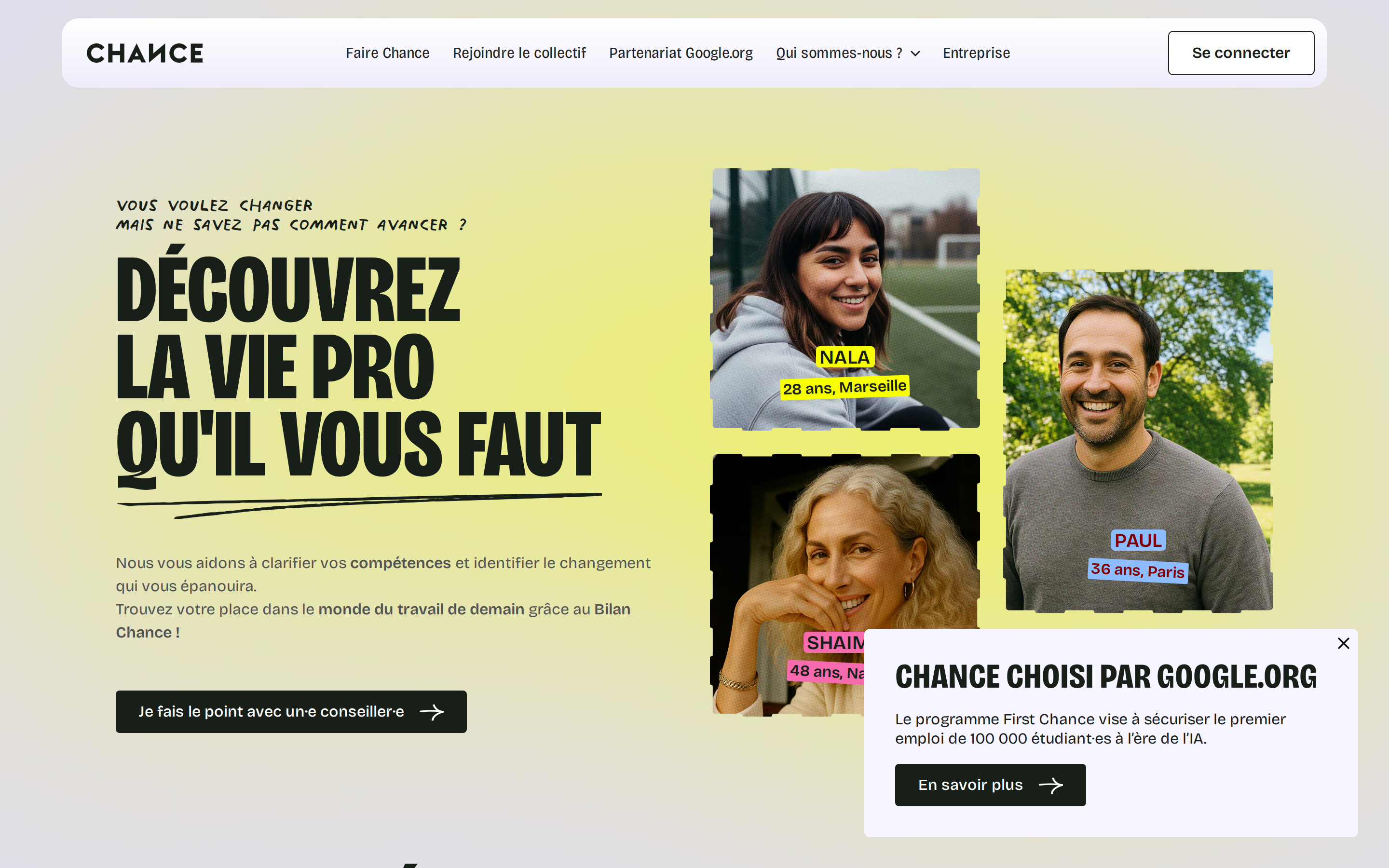
chance.co is built on a mid-light canvas (rgb(224, 221, 238)). The system uses rgb(247, 255, 1) as the high-saturation accent for primary actions. Sharp 0px corners on CTAs — architectural restraint, engineering precision alongside Bricolage Grotesque as the primary typeface. Bricolage Grotesque is paired with webflow-icons for secondary roles. A layered elevation system (5 distinct shadows) building a clear front-to-back hierarchy. Interactions are smoothed by transitions across many elements, with little or no keyframe animation.
Color — roles, semantics & the full census
30 colors measured · click any swatch to copy
No semantic state colors detected — this system signals state through weight & motion, not hue.
30 colors mined from the live renderexpand
Type — the ladder, in the real face
5 roles · rendered live in the real Bricolage Grotesque (captured woff2) · lines are editable, click any spec to copy
Depth — elevation is extracted, not invented
5 box-shadows measured on the live page · click a tile to copy its raw value
Motion — easings, transitions & live keyframes
1 easing curve · 1 keyframes · hover a tile to preview
Spacing & radius, made spatial
9 spacing steps · 7 radii · bars are exact px widths
0px
4px
8px
12px
18px
26px
9999px
Components — the closed vocabulary
14 component families · 66 variants counted on the live DOM
| Component | Variants found |
|---|---|
| buttons | ×10 |
| cards | ×10 |
| links | ×10 |
| cta Banner | ×8 |
| badges | ×6 |
| heading H2 | ×6 |
| nav Links | ×4 |
| heading H3 | ×4 |
| eyebrow Labels | ×2 |
| alert | ×2 |
| pricing Card | ×1 |
| testimonial | ×1 |
| heading H1 | ×1 |
| avatar | ×1 |
Component style specs (§4)expand
Buttons
Light / Invert
- Background:
#ffffff - Text:
#181f18{colors.ink-muted} - Padding: 12px 24px
- Radius: 4px
- Shadow:
rgb(24, 31, 24) 0px 0px 0px 1px - Font: 14px weight 600
- Use: Bright CTA on dark sections
Secondary
- Background:
#181f18{colors.ink-muted} - Text:
#ffffff - Padding: 12px 24px
- Radius: 4px
- Font: 16px weight 500
- Use: Secondary action
Primary Brand
- Background:
#f7ff01{colors.primary} - Text:
#181f18{colors.ink-muted} - Padding: 14px 28px
- Radius: 4px
- Shadow:
rgb(247, 255, 1) 0px 0px 0px 1px - Font: 16px weight 400
- Use: Primary CTA / brand action
Secondary
- Background:
#181f18{colors.ink-muted} - Text:
#ffffff - Padding: 14px 28px
- Radius: 4px
- Shadow:
rgb(24, 31, 24) 0px 0px 0px 1px - Font: 16px weight 400
- Use: Secondary action
Ghost
- Background:
transparent - Text:
#181f18{colors.ink-muted} - Padding: 16px 20.8px
- Radius: 0px
- Font: 16px weight 400
- Use: Subtle action, toolbar, nav button
Secondary
- Background:
#181f18{colors.ink-muted} - Text:
#ffffff - Padding: 6.56px 13.12px
- Radius: 6.4px
- Border: 1px solid rgb(48, 54, 60)
- Font: 13.12px weight 600
- Use: Secondary action
Navigation
Main Nav
- Background:
transparent - Padding: 0px 64px
- Radius: none
Layout — structure & dimensions
5 layout metrics measured
Responsive — real breakpoints
8 media-query stops read from the live CSS
Do's & Don'ts
20 enforceable rules pulled verbatim from the spec
Agent guide & export
Paste-ready prompt + the real files behind this page