prismdinstrument
EXTRACTED · 10 SECTIONS · 20 COLORS · GRADE B

claude.com

Accent #c6613f · anthropicSans — every value below measured via getComputedStyle(), not asserted by hand.

20
colors
6
faces
6
shadows
19
keyframes
claude.com
real render · source of truth

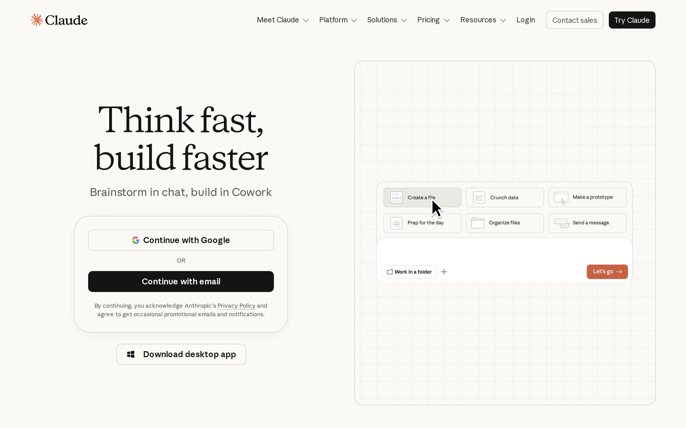
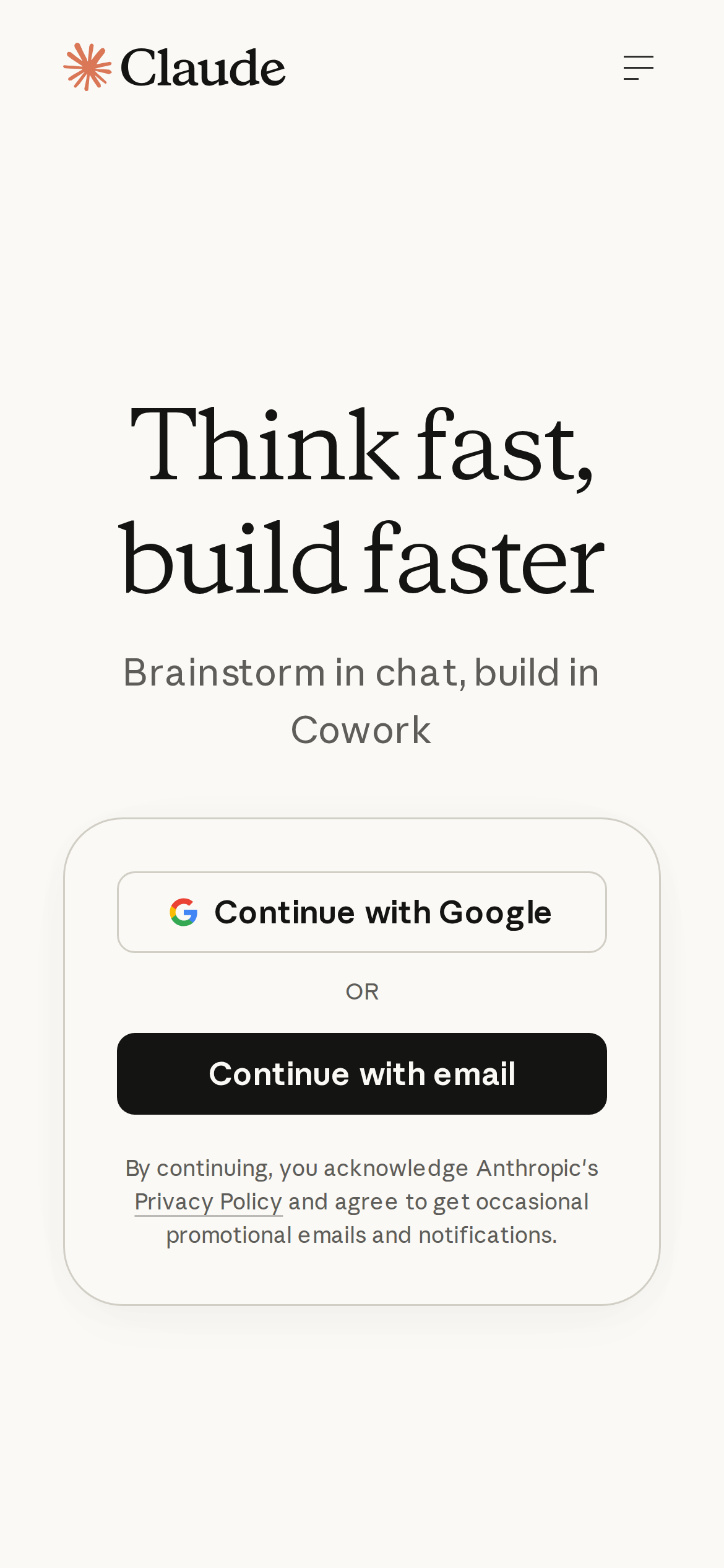
claude.com is built on a warm, off-white canvas (rgb(250, 249, 245)). The system uses rgb(250, 249, 245) as a near-neutral accent (low saturation). Sharp 0px corners on CTAs — architectural restraint, engineering precision alongside editorial serif type (anthropicSerif) — voice of authority. A layered elevation system (6 distinct shadows) building a clear front-to-back hierarchy. Motion is a first-class concern — 19 keyframe animations plus transition-driven interactions.

01

Color — roles, semantics & the full census

20 colors measured · click any swatch to copy

Canvas
#faf9f5
AAA 17.5:1
Ink
#141413
AAA 17.5:1
Accent
#faf9f5
Fail 1:1
Line
#30302e
AAA 12.55:1
Semantic states
error#bf4d43

1 semantic role found.

20 colors mined from the live renderexpand
02

Type — the ladder, in the real face

5 roles · rendered live in the real anthropicSans (captured woff2) · lines are editable, click any spec to copy

display xl
display-xl72px · 330
display md
display-md30px · 400 · ×2.40
body
body12px · 400 · ×2.50
button
button17px · 600 · ×0.71
mono
mono12px · 400 · ×1.42
04

Depth — elevation is extracted, not invented

6 box-shadows measured on the live page · click a tile to copy its raw value

shadow-1
shadow-2
shadow-3
shadow-4
shadow-5
05

Motion — easings, transitions & live keyframes

8 easing curves · 19 keyframes · hover a tile to preview

Easing & transitions
transition-2ease-in
transition-4cubic-bezier(0.165, 0.84, 0.44, 1)
ease-in-out-quartcubic-bezier(.77,0,.175,1)
ease-out-quartcubic-bezier(.165,.84,.44,1)
ease-in-quartcubic-bezier(.895,.03,.685,.22)
ease-in-out-expocubic-bezier(1,0,0,1)
ease-in-out-power3cubic-bezier(.645,.045,.355,1)
ease-out-power2cubic-bezier(.25,1,.5,1)
19 keyframe animations extracted
NavMobile-module-scss-module__twGYTa__panelOpen
NavMobile-module-scss-module__twGYTa__panelClose
NavMobile-module-scss-module__twGYTa__itemFadeUp
NavBar-module-scss-module__s3E3Dq__navSlideDown
PromptCards-module-scss-module__HcTnea__tabFadeUp
MediaTabs-module-scss-module__M-mPca__tabFadeUp
Pricing-module-scss-module__GLAe0a__cardRaise
Marquee-module-scss-module__-zurhq__marquee
LetterGrid-module-scss-module__R6_SpW__hudFadeIn
TypewriterWord-module-scss-module__sRUGCG__blink
AppShell-module-scss-module__F71GCG__row-dot-wave
AppShell-module-scss-module__F71GCG__shell-spark-spin
03

Spacing & radius, made spatial

9 spacing steps · 7 radii · bars are exact px widths

Spacing scale
xxs · 2px
xs · 16px
sm · 24px
md · 32px
base · 48px
lg · 56px
xl · 64px
2xl · 72px
3xl · 80px
Radius
none
0px
xs
4px
sm
8px
md
12px
lg
16px
xl
32px
full
9999px
06

Components — the closed vocabulary

16 component families · 56 variants counted on the live DOM

ComponentVariants found
buttons×10
links×8
accordion×7
nav Links×5
cards×4
tabs×4
cta Banner×4
captions×3
heading H2×2
heading H3×2
price Tag×2
inputs×1
status Badge×1
footer Links×1
heading H1×1
divider×1
Component style specs (§4)expand

Buttons

Ghost

  • Background: transparent
  • Text: #30302e {colors.hairline}
  • Padding: 8px 0px
  • Radius: 0px
  • Font: 15px weight 400
  • Use: Subtle action, toolbar, nav button
  • Focus: color: rgb(46, 46, 44), border: 0px none rgb(46, 46, 44), borderColor: rgb(46, 46, 44)

Light / Invert

  • Background: #faf9f5 {colors.primary}
  • Text: #5e5d59
  • Padding: 8px 12px
  • Radius: 8px
  • Shadow: rgb(209, 207, 197) 0px 0px 0px 1px
  • Font: 15px weight 400
  • Use: Bright CTA on dark sections
  • Focus: color: rgb(46, 46, 44), border: 0px none rgb(46, 46, 44), borderColor: rgb(46, 46, 44)

Dark / Solid

  • Background: #141413 {colors.primary-hover}
  • Text: #faf9f5 {colors.primary}
  • Padding: 8px 12px
  • Radius: 8px
  • Font: 15px weight 400
  • Use: Solid dark CTA
  • Focus: color: rgb(46, 46, 44), border: 0px none rgb(46, 46, 44), borderColor: rgb(46, 46, 44)

Light / Invert

  • Background: #faf9f5 {colors.primary}
  • Text: #141413 {colors.primary-hover}
  • Padding: 0px 20px
  • Radius: 9.6px
  • Border: 1px solid rgb(209, 207, 197)
  • Font: 17px weight 600
  • Use: Bright CTA on dark sections
  • Focus: color: rgb(46, 46, 44), border: 0px none rgb(46, 46, 44), borderColor: rgb(46, 46, 44)

Ghost

  • Background: transparent
  • Text: #141413 {colors.primary-hover}
  • Padding: 0px 24px
  • Radius: 8px
  • Font: 14px weight 500
  • Use: Subtle action, toolbar, nav button
  • Focus: color: rgb(46, 46, 44), border: 0px none rgb(46, 46, 44), borderColor: rgb(46, 46, 44)

Dark / Solid

  • Background: #141413 {colors.primary-hover}
  • Text: #faf9f5 {colors.primary}
  • Padding: 8px 16px
  • Radius: 8px
  • Font: 16px weight 500
  • Use: Solid dark CTA
  • Focus: color: rgb(46, 46, 44), border: 0px none rgb(46, 46, 44), borderColor: rgb(46, 46, 44)

Icon Button

  • Background: #c6613f
07

Layout — structure & dimensions

4 layout metrics measured

header 84px 1440px max-width
max Width1440px
header Height84px
sidebar Width0px
container Padding0px
08

Responsive — real breakpoints

12 media-query stops read from the live CSS

349px
566px
567px
600px
767px
768px
833px
834px
991px
1000px
1199px
1200px
09

Do's & Don'ts

22 enforceable rules pulled verbatim from the spec

Do
Use Off-White (`#faf9f5`) as the page background — it's intentionally not pure white
Use Near-Black (`#141413`) for text — not pure black, it's warmer and more readable
Use anthropicSans as the primary typeface — it defines the brand personality
Use the extracted shadow patterns for elevation — they are tuned to match the brand palette
Use Off-White (`#faf9f5`) as the primary accent — it's the brand's signature interactive color
Use 8px border-radius on buttons — the standard corner rounding for interactive elements
Maintain nav height at 88px — consistent vertical space for the navigation bar
Make the hero full-viewport (≥70% screen height) — this design uses an immersive hero, not a tall navbar
Build the hero as a split layout with media on the left — text and visual share equal weight
Include exactly 4 CTAs in the hero (primary + secondary) — this design pattern is multi-action, not single-purpose
Each card includes a top image — imagery is part of the card identity, not optional
Use a 3-column grid on desktop — density matters for this content type
Place 3 pricing tiers side-by-side on desktop — direct comparison is the value prop
Use expandable accordion for the FAQ — saves vertical space and lets users self-navigate
Don't
Don't use pure white (`#ffffff`) as a page background — the warm tone is part of the brand identity
Don't use pure black (`#000000`) for text — the near-black adds warmth
Don't substitute with generic sans-serif or serif — the custom font carries the brand
Don't invent new shadow values — use only the extracted shadow levels
Don't introduce additional saturated accent colors — the palette is intentionally controlled
Don't collapse or hide the nav on scroll without an explicit scroll-triggered animation — the design uses fixed nav presence
Don't make the nav sticky — this design lets it scroll away to maximize content focus
Don't put a CTA button in the nav — this design uses links only at the top
10

Agent guide & export

Paste-ready prompt + the real files behind this page

Build a UI in the claude.com design system. Canvas #faf9f5 · ink #141413 · accent #faf9f5. Type: anthropicSans — respect the size/weight ladder in §3. Radius, spacing, shadow: use only the extracted scales (no magic numbers). Full spec follows — paste the DESIGN.md below into your agent.
Every value above was getComputedStyle-verified.
$ npx prismd add claude
DESIGN.md · narrative spec tokens.json
A · InstrumentB · Press