prismdinstrument
EXTRACTED · 10 SECTIONS · 34 COLORS · GRADE B

framer.com

Accent #0099ff · Inter Variable — every value below measured via getComputedStyle(), not asserted by hand.

34
colors
10
faces
18
shadows
3
keyframes
framer.com
real render · source of truth

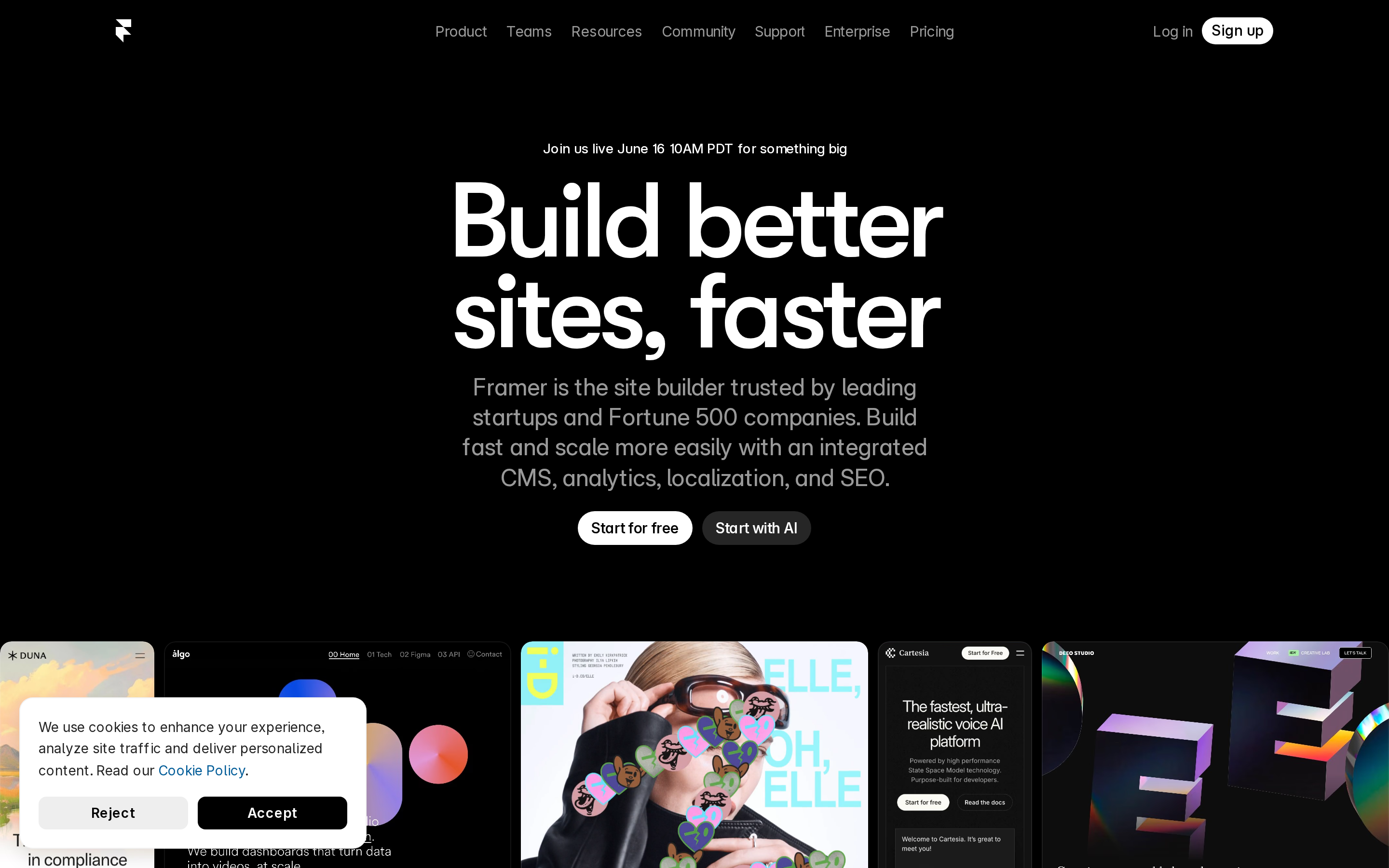
framer.com is built on a near-black canvas (rgb(0, 0, 0)). The system uses rgb(255, 255, 255) as the singular interactive color. Generously rounded CTAs (40px) suggest approachable, content-first design alongside GT Walsheim Framer Medium as the primary typeface. GT Walsheim Framer Medium is paired with Inter Variable Placeholder for secondary roles. A layered elevation system (18 distinct shadows) building a clear front-to-back hierarchy. Motion is minimal — a few targeted transitions, no decorative animation.

01

Color — roles, semantics & the full census

34 colors measured · click any swatch to copy

Canvas
#0e0e10
AAA 19.28:1
Ink
#ffffff
AAA 19.28:1
Accent
#ffffff
AAA 19.28:1
Line
#ffffff
AAA 19.28:1
Semantic states

No semantic state colors detected — this system signals state through weight & motion, not hue.

34 colors mined from the live renderexpand
02

Type — the ladder, in the real face

5 roles · rendered live in the real sans-serif (captured woff2) · lines are editable, click any spec to copy

display xl
display-xl110px · 500
display md
display-md24px · 400 · ×4.58
headline
headline85px · 500 · ×0.28
body
body12px · 400 · ×7.08
mono
mono14px · 600 · ×0.86
04

Depth — elevation is extracted, not invented

18 box-shadows measured on the live page · click a tile to copy its raw value

shadow-1
shadow-2
shadow-3
shadow-4
shadow-5
05

Motion — easings, transitions & live keyframes

1 easing curve · 3 keyframes · hover a tile to preview

Easing & transitions
transition-3cubic-bezier(0.44, 0, 0.56, 1)
3 keyframe animations extracted
Typewriter-cursor
__framer-blink-input
__framer-loading-spin
03

Spacing & radius, made spatial

9 spacing steps · 7 radii · bars are exact px widths

Spacing scale
xxs · 2px
xs · 5px
sm · 10px
md · 20px
base · 30px
lg · 32px
xl · 40px
2xl · 60px
3xl · 80px
Radius
none
0px
xs
4px
sm
8px
md
14px
lg
20px
xl
31px
full
9999px
06

Components — the closed vocabulary

10 component families · 45 variants counted on the live DOM

ComponentVariants found
nav Links×10
links×10
footer Links×7
buttons×6
heading H3×4
inputs×2
heading H2×2
heading H6×2
heading H1×1
heading H5×1
Component style specs (§4)expand

Buttons

Ghost

  • Background: transparent
  • Text: #000000
  • Padding: 20px 2.5px 20px 20px
  • Radius: 0px
  • Font: 12px weight 400
  • Use: Subtle action, toolbar, nav button
  • Focus: outline: rgb(16, 16, 16) auto 1px

Pill

  • Background: #ffffff {colors.hairline}
  • Text: #0000ee
  • Padding: 6px 10px 7px
  • Radius: 15px
  • Font: 12px weight 400
  • Use: Status pills, tags, chips
  • Focus: outline: rgb(16, 16, 16) auto 1px

Pill

  • Background: #ffffff {colors.hairline}
  • Text: #0000ee
  • Padding: 10px 14px
  • Radius: 100px
  • Font: 12px weight 400
  • Use: Status pills, tags, chips
  • Focus: outline: rgb(16, 16, 16) auto 1px

Navigation

Main Nav

  • Background: transparent
  • Padding: 0px 40px
  • Radius: none
  • Font: 12px weight 400
  • Use: Fixed/sticky flex nav — N/A items
07

Layout — structure & dimensions

5 layout metrics measured

header 421px 1200px max-width
max Width1200px
header Height421px
sidebar Width0px
gap0px
container Padding0px
08

Responsive — real breakpoints

3 media-query stops read from the live CSS

809px
810px
1199px
09

Do's & Don'ts

18 enforceable rules pulled verbatim from the spec

Do
Use dark background (`#000000`) as the foundation — this is a dark-mode-native design
Keep font weights between 400-500 — the system uses a narrow weight range for subtle hierarchy
Use negative letter-spacing (-5.5px) at display sizes for compressed, editorial headlines
Use the extracted shadow patterns for elevation — they are tuned to match the brand palette
Use Pure White (`#ffffff`) as the primary accent — it's the brand's signature interactive color
Use 100px border-radius on primary buttons — the brand uses generously-rounded CTAs
Maintain nav height at 64px — consistent vertical space for the navigation bar
Respect the 5px–40px spacing range — the design uses a wide scale for visual breathing room
Include exactly 2 CTAs in the hero (primary + secondary) — this design pattern is multi-action, not single-purpose
Each card includes a top image — imagery is part of the card identity, not optional
Don't
Don't use light backgrounds — the dark canvas is the native medium
Don't use weight 700 (bold) or above — 500 is the maximum weight in this system
Don't increase letter-spacing on headings — the type is designed to run tight at scale
Don't invent new shadow values — use only the extracted shadow levels
Don't introduce additional saturated accent colors — the palette is intentionally controlled
Don't use sharp-cornered or pill buttons — 100px is the CTA border-radius standard
Don't collapse or hide the nav on scroll without an explicit scroll-triggered animation — the design uses fixed nav presence
Don't make the nav sticky — this design lets it scroll away to maximize content focus
10

Agent guide & export

Paste-ready prompt + the real files behind this page

Build a UI in the framer.com design system. Canvas #0e0e10 · ink #ffffff · accent #ffffff. Type: Inter Variable — respect the size/weight ladder in §3. Radius, spacing, shadow: use only the extracted scales (no magic numbers). Full spec follows — paste the DESIGN.md below into your agent.
Every value above was getComputedStyle-verified.
$ npx prismd add framer
DESIGN.md · narrative spec tokens.json
A · InstrumentB · Press