prismdinstrument
EXTRACTED · 10 SECTIONS · 10 COLORS · GRADE C

lovable.dev

Accent #4b4be6 · Camera Plain Variable — every value below measured via getComputedStyle(), not asserted by hand.

10
colors
2
faces
11
shadows
38
keyframes
lovable.dev
real render · source of truth

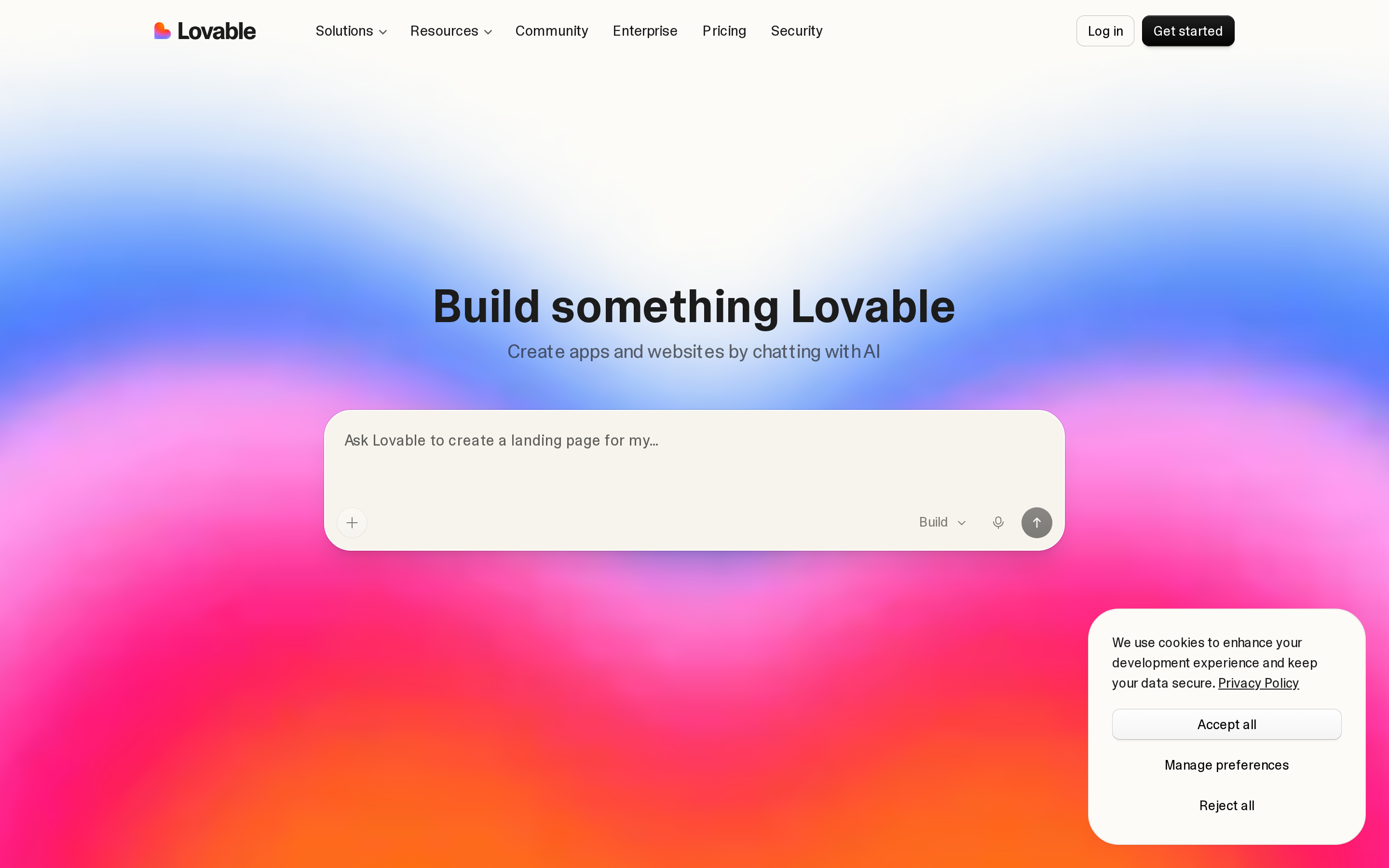
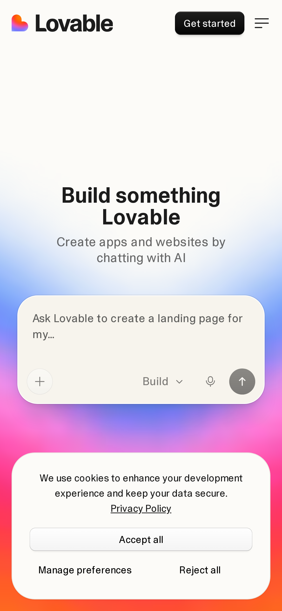
lovable.dev is built on a warm, off-white canvas (rgb(252, 251, 248)). The system uses rgb(0, 0, 0) as the singular interactive color. Sharp 0px corners on CTAs — architectural restraint, engineering precision alongside Camera Plain Variable as the primary typeface. A layered elevation system (11 distinct shadows) building a clear front-to-back hierarchy. Motion is a first-class concern — 38 keyframe animations plus transition-driven interactions.

01

Color — roles, semantics & the full census

10 colors measured · click any swatch to copy

Canvas
#fcfbf8
AAA 16.47:1
Ink
#1c1c1c
AAA 16.47:1
Accent
#4b4be6
AA 5.89:1
Line
#5f5f5d
AA 6.18:1
Semantic states

No semantic state colors detected — this system signals state through weight & motion, not hue.

10 colors mined from the live renderexpand
02

Type — the ladder, in the real face

6 roles · rendered live in the real Camera Plain Variable (captured woff2) · lines are editable, click any spec to copy

display xl
display-xl60px · 600
display lg
display-lg48px · 600 · ×1.25
display md
display-md36px · 600 · ×1.33
body
body14px · 400 · ×2.57
body sm
body-sm14px · 480 · ×1.00
button
button15px · 400 · ×0.93
04

Depth — elevation is extracted, not invented

11 box-shadows measured on the live page · click a tile to copy its raw value

shadow-1
shadow-2
05

Motion — easings, transitions & live keyframes

9 easing curves · 38 keyframes · hover a tile to preview

Easing & transitions
transition-3cubic-bezier(0.4, 0, 0.2, 1)
transition-4cubic-bezier(0.33, 1, 0.68, 1)
ease-incubic-bezier(.4, 0, 1, 1)
default-transition-timing-functioncubic-bezier(.4, 0, .2, 1)
ease-out-quintcubic-bezier(.23, 1, .32, 1)
ease-outcubic-bezier(0, 0, .2, 1)
ease-out-cubiccubic-bezier(.215, .61, .355, 1)
ease-in-out-quadcubic-bezier(.455, .03, .515, .955)
38 keyframe animations extracted
heartbeat
shake
animate-blink
task-status-spin
gradient-sweep
message-highlight
enter
exit
spin
pulse
bounce
accordion-down
03

Spacing & radius, made spatial

9 spacing steps · 7 radii · bars are exact px widths

Spacing scale
xxs · 2px
xs · 4px
sm · 8px
md · 10px
base · 24px
lg · 40px
xl · 56px
2xl · 80px
3xl · 180px
Radius
none
0px
xs
calc(.5rem - 4px)
sm
8px
md
12px
lg
16px
xl
32px
full
9999px
06

Components — the closed vocabulary

8 component families · 32 variants counted on the live DOM

ComponentVariants found
buttons×10
links×7
nav Links×4
footer Links×3
heading H2×3
cards×2
heading H3×2
heading H1×1
Component style specs (§4)expand

Buttons

Dark / Solid

  • Background: #000000
  • Text: #fafafa
  • Padding: 6px 10px
  • Radius: 8px
  • Font: 14px weight 400
  • Use: Solid dark CTA

Ghost

  • Background: transparent
  • Text: #1c1c1c {colors.ink-muted}
  • Padding: 4px 0px 4px 6px
  • Radius: 0px
  • Font: 15px weight 400
  • Use: Subtle action, toolbar, nav button

Ghost

  • Background: transparent
  • Text: #030303
  • Padding: 6px 10px
  • Radius: 8px
  • Font: 14px weight 400
  • Use: Subtle action, toolbar, nav button

Icon Button

  • Background: #ffffff {colors.on-primary}
  • Text: #030303
  • Padding: 0px
  • Radius: 9999px
  • Font: 14px weight 400
  • Use: Toolbar/UI icons

Icon Button

  • Background: transparent
  • Text: #030303
  • Padding: 0px
  • Radius: 9999px
  • Font: 14px weight 400
  • Use: Toolbar/UI icons

Light / Invert

  • Background: #f7f4ed {colors.surface-2}
  • Text: #1c1c1c {colors.ink-muted}
  • Padding: 0px
  • Radius: 12px
  • Font: 16px weight 400
  • Use: Bright CTA on dark sections
07

Layout — structure & dimensions

4 layout metrics measured

header 64px 1200px max-width
max Width1200px
header Height64px
sidebar Width0px
container Padding0px
08

Responsive — real breakpoints

1 media-query stops read from the live CSS

600px
09

Do's & Don'ts

16 enforceable rules pulled verbatim from the spec

Do
Use Off-White (`#fcfbf8`) as the page background — it's intentionally not pure white
Use Near-Black (`#1c1c1c`) for text — not pure black, it's warmer and more readable
Use Camera Plain Variable as the primary typeface — it defines the brand personality
Use the extracted shadow patterns for elevation — they are tuned to match the brand palette
Use Black (`#000000`) as the primary accent — it's the brand's signature interactive color
Use 8px border-radius on buttons — the standard corner rounding for interactive elements
Respect the 4px–56px spacing range — the design uses a wide scale for visual breathing room
Each card includes a left image — imagery is part of the card identity, not optional
Build a content-dense footer (5 columns, ~52 links) — this site treats the footer as a sitemap, not an afterthought
Don't
Don't use pure white (`#ffffff`) as a page background — the warm tone is part of the brand identity
Don't use pure black (`#000000`) for text — the near-black adds warmth
Don't substitute with generic sans-serif or serif — the custom font carries the brand
Don't invent new shadow values — use only the extracted shadow levels
Don't introduce additional saturated accent colors — the palette is intentionally controlled
Don't make the nav sticky — this design lets it scroll away to maximize content focus
Don't put a CTA button in the nav — this design uses links only at the top
10

Agent guide & export

Paste-ready prompt + the real files behind this page

Build a UI in the lovable.dev design system. Canvas #fcfbf8 · ink #1c1c1c · accent #4b4be6. Type: Camera Plain Variable — respect the size/weight ladder in §3. Radius, spacing, shadow: use only the extracted scales (no magic numbers). Full spec follows — paste the DESIGN.md below into your agent.
Every value above was getComputedStyle-verified.
$ npx prismd add lovable
DESIGN.md · narrative spec tokens.json
A · InstrumentB · Press