prismdinstrument
EXTRACTED · 10 SECTIONS · 13 COLORS · GRADE B

mastercard.com

Accent #5e6ad2 · mccom — every value below measured via getComputedStyle(), not asserted by hand.

13
colors
85
faces
5
shadows
19
keyframes
mastercard.com
real render · source of truth

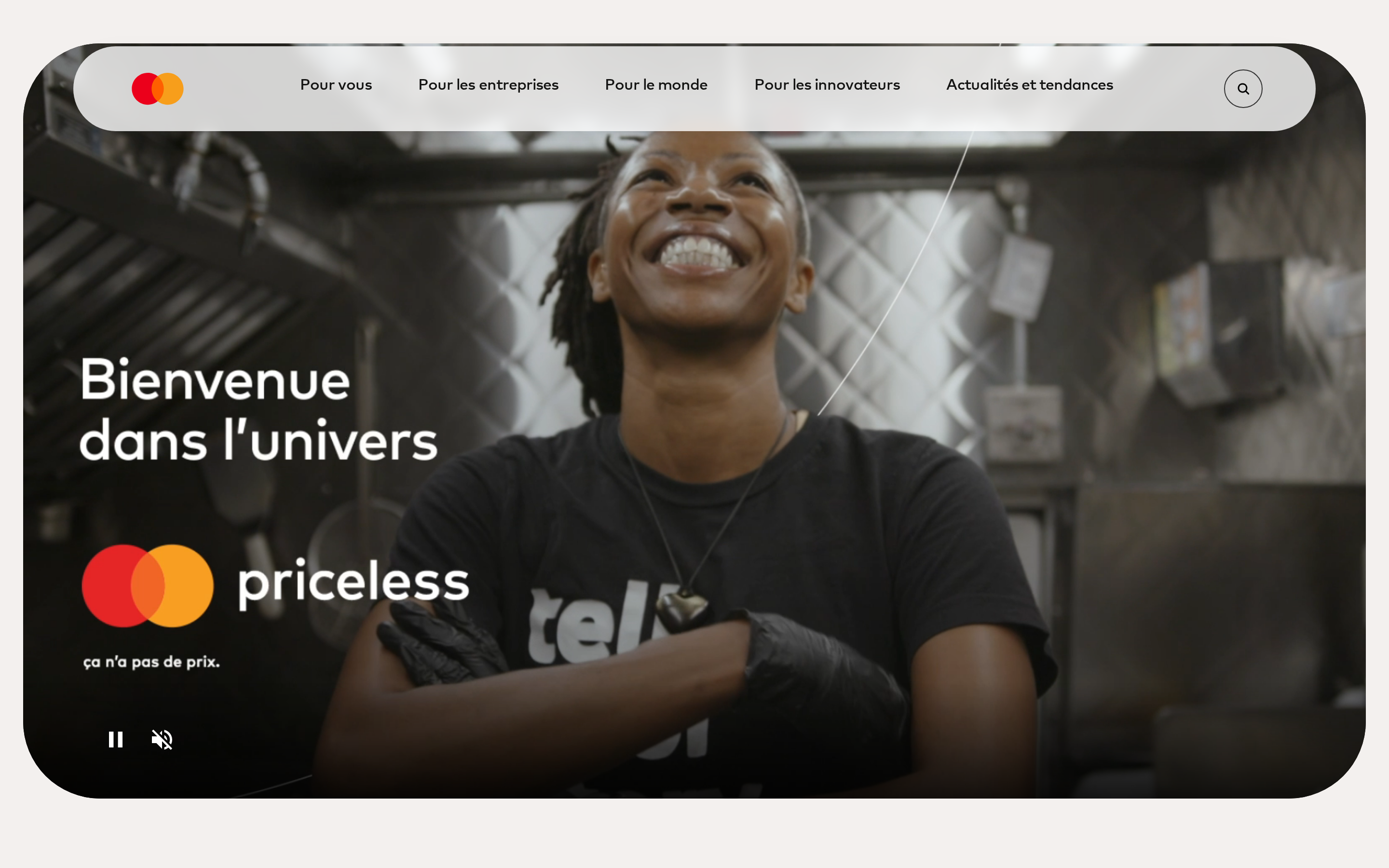
mastercard.com is built on a warm, off-white canvas (rgb(243, 240, 238)). The system uses rgb(243, 115, 56) as the high-saturation accent for primary actions. Sharp 0px corners on CTAs — architectural restraint, engineering precision alongside mccom as the primary typeface. Mccom is paired with MarkOffcForMC for secondary roles. A layered elevation system (5 distinct shadows) building a clear front-to-back hierarchy. Motion is a first-class concern — 19 keyframe animations plus transition-driven interactions.

01

Color — roles, semantics & the full census

13 colors measured · click any swatch to copy

Canvas
#f3f0ee
AAA 16.25:1
Ink
#141413
AAA 16.25:1
Accent
#f37338
Fail 2.53:1
Line
#333333
AAA 11.14:1
Semantic states
error#ee0000success#038a00warning#f38b00

3 semantic roles found.

13 colors mined from the live renderexpand
02

Type — the ladder, in the real face

7 roles · system fallback — no woff2 captured · lines are editable, click any spec to copy

display xl
display-xl120px · 500
display lg
display-lg64px · 500 · ×1.88
display md
display-md24px · 500 · ×2.67
headline
headline14px · 700 · ×1.71
body
body16px · 450 · ×0.88
button
button16px · 500 · ×1.00
mono
mono16px · 400 · ×1.00
04

Depth — elevation is extracted, not invented

5 box-shadows measured on the live page · click a tile to copy its raw value

shadow-1
shadow-2
shadow-3
shadow-4
shadow-5
05

Motion — easings, transitions & live keyframes

2 easing curves · 19 keyframes · hover a tile to preview

Easing & transitions
transition-2ease-in-out
ais-transition-timing-functioncubic-bezier(0.4,0,0.2,1)
19 keyframe animations extracted
cmp-search__loading-indicator-spin
ais-fadeIn
ais-chat-loader-spinner
ais-chat-loader-skeleton
ais-chat-loader-text
ais-filter-suggestions-skeleton
vjs-spinner-show
vjs-spinner-spin
vjs-spinner-fade
delay-overflow
animate-image
animate-image-pill
03

Spacing & radius, made spatial

9 spacing steps · 7 radii · bars are exact px widths

Spacing scale
xxs · 2px
xs · 4px
sm · 6px
md · 12px
base · 16px
lg · 24px
xl · 32px
2xl · 48px
3xl · 76px
Radius
none
0px
xs
4px
sm
9px
md
20px
lg
30px
xl
40px
full
999px
06

Components — the closed vocabulary

15 component families · 43 variants counted on the live DOM

ComponentVariants found
status Badge×10
footer Links×6
heading H3×6
cta Banner×5
tabs×3
buttons×2
inputs×2
heading H5×2
search Bar×1
badges×1
nav Links×1
heading H1×1
heading H2×1
heading H6×1
links×1
Component style specs (§4)expand

Buttons

Pill

  • Background: transparent
  • Text: #141413 {colors.ink-muted}
  • Padding: 0px
  • Radius: 999px
  • Font: 16px weight 500
  • Use: Status pills, tags, chips

Ghost

  • Background: transparent
  • Text: #141413 {colors.ink-muted}
  • Padding: 8px
  • Radius: 0px
  • Font: 16px weight 500
  • Use: Subtle action, toolbar, nav button

Pill

  • Background: transparent
  • Text: #141413 {colors.ink-muted}
  • Padding: 19px
  • Radius: 99px
  • Font: 16px weight 500
  • Use: Status pills, tags, chips

Inputs & Forms

Text Input

  • Background: transparent
  • Text: #262627
  • Padding: 0px 24px
  • Radius: 0px
  • Border: 0px none rgb(38, 38, 39)
  • Font: 16px weight 400
  • Use: Text fields, search inputs

Status Badges

Tinted

  • Background: #f37338 {colors.primary}
  • Text: #f3f0ee {colors.surface-1}
  • Padding: 0px
  • Radius: 50px
  • Font: 0px weight 450
  • Use: Status indicator, label, pill

Tabs

Pill Tab

  • Background: #f37338 {colors.primary}
  • Text: #f3f0ee {colors.surface-1}
  • Padding: 0px
  • Radius: 50px
  • Font: 0px weight 450
  • Use: Navigation tabs, filter tabs
07

Layout — structure & dimensions

4 layout metrics measured

header 64px 680px max-width
max Width680px
header Height64px
sidebar Width0px
container Padding0px 12px
08

Responsive — real breakpoints

30 media-query stops read from the live CSS

375px
388px
400px
425px
426px
530px
550px
575px
599px
600px
601px
640px
680px
767px
768px
896px
939px
940px
941px
991px
999px
1024px
1200px
1239px
1240px
1424px
1439px
1440px
2000px
2700px
09

Do's & Don'ts

21 enforceable rules pulled verbatim from the spec

Do
Use Off-White (`#f3f0ee`) as the page background — it's intentionally not pure white
Use Near-Black (`#141413`) for text — not pure black, it's warmer and more readable
Use mccom as the primary typeface — it defines the brand personality
Use negative letter-spacing (-1.28px) at display sizes for compressed, editorial headlines
Use the extracted shadow patterns for elevation — they are tuned to match the brand palette
Use full-pill radius (9999px) only for specific elements (avatars, pills, toggles)
Use Coral (`#f37338`) as the primary accent — it's the brand's signature interactive color
Use 99px border-radius on primary buttons — the brand uses generously-rounded CTAs
Respect the 4px–32px spacing range — the design uses a wide scale for visual breathing room
Make the hero full-viewport (≥70% screen height) — this design uses an immersive hero, not a tall navbar
Build the hero as a split layout with media on the right — text and visual share equal weight
Include exactly 2 CTAs in the hero (primary + secondary) — this design pattern is multi-action, not single-purpose
Build a content-dense footer (4 columns, ~27 links) — this site treats the footer as a sitemap, not an afterthought
Don't
Don't use pure white (`#ffffff`) as a page background — the warm tone is part of the brand identity
Don't use pure black (`#000000`) for text — the near-black adds warmth
Don't substitute with generic sans-serif or serif — the custom font carries the brand
Don't increase letter-spacing on headings — the type is designed to run tight at scale
Don't invent new shadow values — use only the extracted shadow levels
Don't apply pill radius on rectangular buttons or cards — it's reserved for specific interactive elements
Don't introduce additional saturated accent colors — the palette is intentionally controlled
Don't use sharp-cornered or pill buttons — 99px is the CTA border-radius standard
10

Agent guide & export

Paste-ready prompt + the real files behind this page

Build a UI in the mastercard.com design system. Canvas #f3f0ee · ink #141413 · accent #f37338. Type: mccom — respect the size/weight ladder in §3. Radius, spacing, shadow: use only the extracted scales (no magic numbers). Full spec follows — paste the DESIGN.md below into your agent.
Every value above was getComputedStyle-verified.
$ npx prismd add mastercard
DESIGN.md · narrative spec tokens.json
A · InstrumentB · Press