miro.com
Accent #fde050 · Roobert PRO — every value below measured via getComputedStyle(), not asserted by hand.
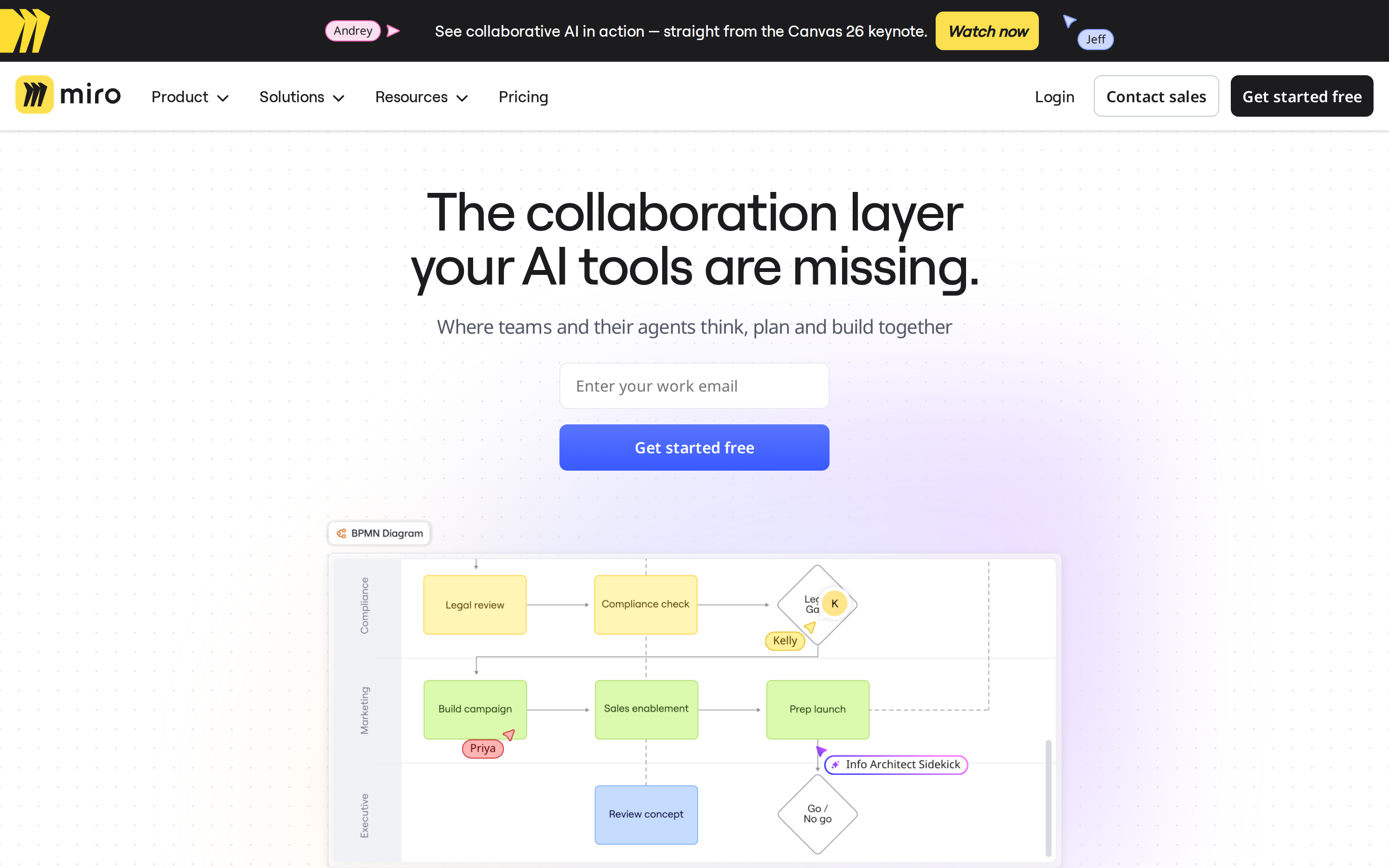

miro.com is built on a soft, near-white canvas (rgb(240, 240, 240)). The system uses rgb(28, 28, 30) as a near-neutral accent (low saturation). Moderately rounded CTAs (8px) — modern SaaS standard, neither sharp nor pill alongside Roobert PRO Medium as the primary typeface. Roobert PRO Medium is paired with Noto Sans for secondary roles. A layered elevation system (5 distinct shadows) building a clear front-to-back hierarchy. Motion is a first-class concern — 14 keyframe animations plus transition-driven interactions.
Color — roles, semantics & the full census
51 colors measured · click any swatch to copy
3 semantic roles found.
51 colors mined from the live renderexpand
Type — the ladder, in the real face
5 roles · rendered live in the real sans-serif (captured woff2) · lines are editable, click any spec to copy
Depth — elevation is extracted, not invented
5 box-shadows measured on the live page · click a tile to copy its raw value
Motion — easings, transitions & live keyframes
3 easing curves · 14 keyframes · hover a tile to preview
Spacing & radius, made spatial
9 spacing steps · 7 radii · bars are exact px widths
0px
8px
12px
20px
24px
40px
999px
Components — the closed vocabulary
10 component families · 27 variants counted on the live DOM
| Component | Variants found |
|---|---|
| buttons | ×10 |
| heading H2 | ×4 |
| heading H3 | ×3 |
| footer Links | ×2 |
| heading H1 | ×2 |
| links | ×2 |
| inputs | ×1 |
| cards | ×1 |
| nav Links | ×1 |
| pricing Card | ×1 |
Component style specs (§4)expand
Buttons
Ghost
- Background:
transparent - Text:
#1c1c1e{colors.primary} - Padding: 4px
- Radius: 8px
- Font: 12px weight 400
- Use: Subtle action, toolbar, nav button
Primary Brand
- Background:
#fde050{colors.semantic-warning} - Text:
#1c1c1e{colors.primary} - Padding: 8px 12px
- Radius: 8px
- Font: 16px weight 900
- Use: Primary CTA / brand action
Ghost
- Background:
transparent - Text:
#1c1c1e{colors.primary} - Padding: 8px 4px 8px 8px
- Radius: 8px
- Font: 16px weight 500
- Use: Subtle action, toolbar, nav button
Outline
- Background:
transparent - Text:
#1c1c1e{colors.primary} - Padding: 8px 12px
- Radius: 8px
- Border: 1px solid rgb(199, 202, 213)
- Font: 16px weight 600
- Use: Secondary action with border
Secondary
- Background:
#1c1c1e{colors.primary} - Text:
#ffffff{colors.on-primary} - Padding: 8px 12px
- Radius: 8px
- Font: 16px weight 600
- Use: Secondary action
Icon Button
- Background:
#ffffff{colors.on-primary} - Text:
#1c1c1e{colors.primary} - Padding: 12px 12px 12px 9px
- Radius: 50%
- Shadow:
rgba(0, 0, 0, 0.18) 0px 0.602187px 0.602187px -1.25px, rgba(0, 0, 0, 0.16) 0px 2... - Font: 12px weight 400
- Use: Toolbar/UI icons
Icon Button
- Background:
#ffffff{colors.on-primary} - Text:
#1c1c1e{colors.primary} - Padding: 12px 9px 12px 12px
- Radius: 50%
- Shadow:
rgba(0, 0, 0, 0.18) 0px 0.602187px 0.602187px -1.25px, rgba(0, 0, 0, 0.16) 0px 2... - Font: 12px weight 400
- Use: Toolbar/UI icons
Layout — structure & dimensions
5 layout metrics measured
Responsive — real breakpoints
26 media-query stops read from the live CSS
Do's & Don'ts
17 enforceable rules pulled verbatim from the spec
Agent guide & export
Paste-ready prompt + the real files behind this page