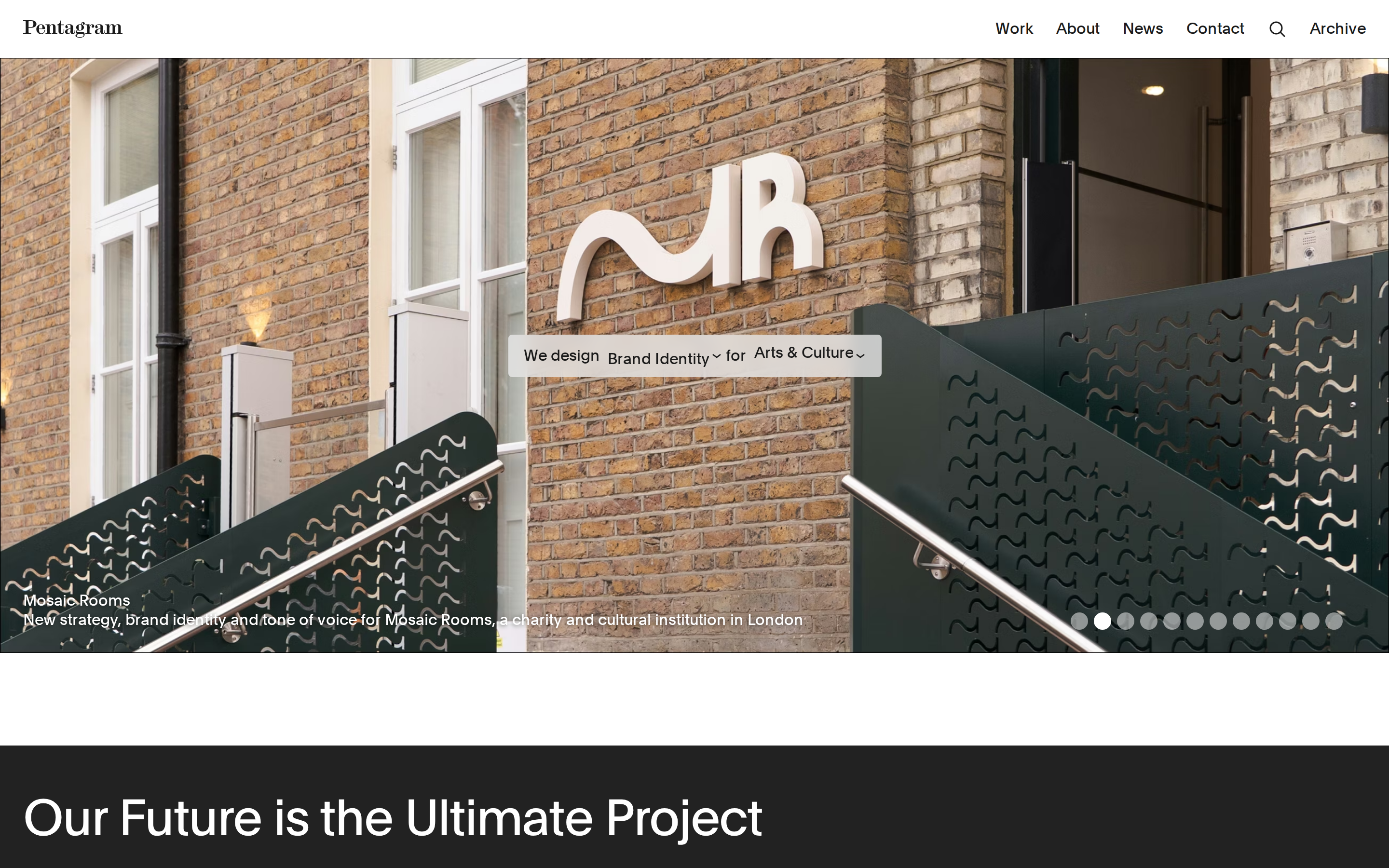
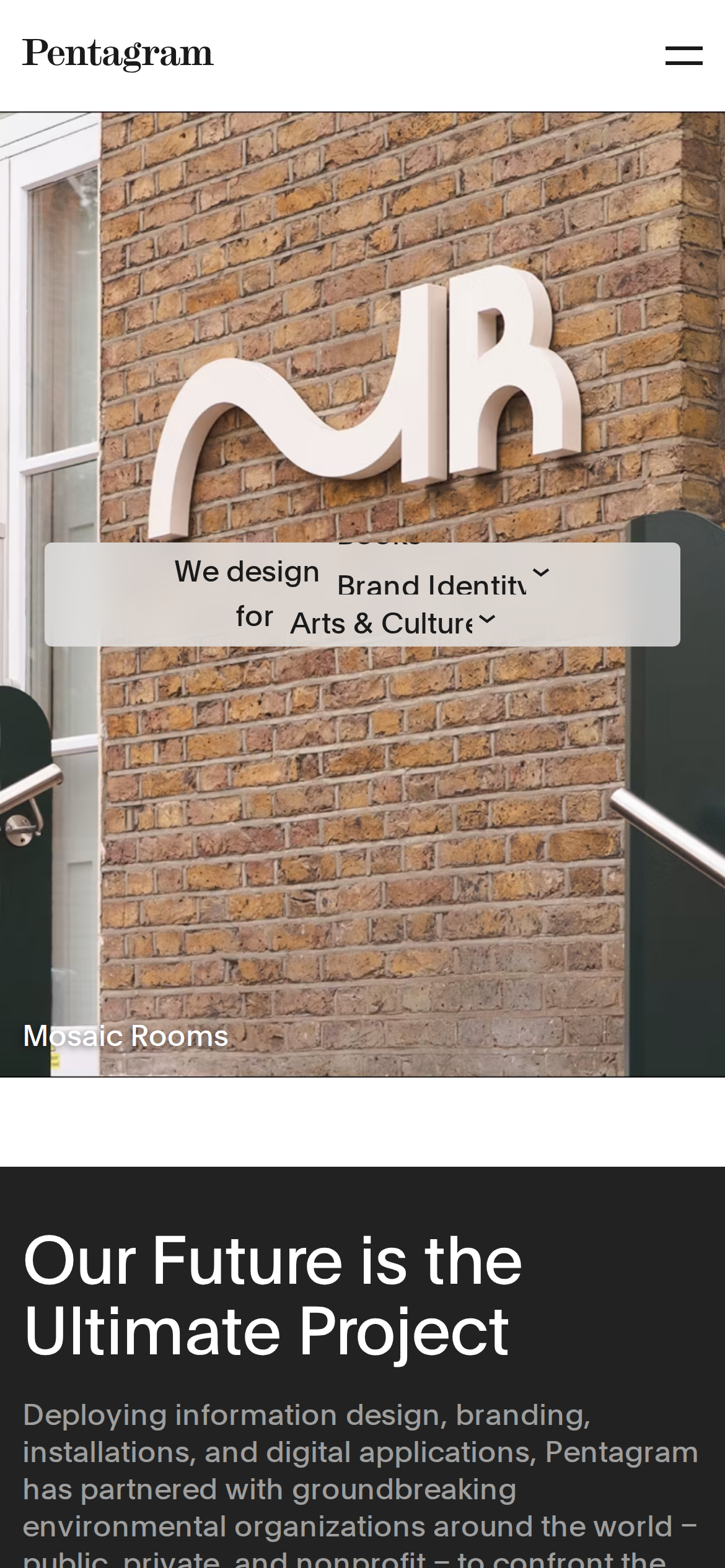
pentagram.com
Accent #5e6ad2 · Plain — every value below measured via getComputedStyle(), not asserted by hand.
pentagram.com is built on a pure-white canvas (rgb(255,255,255)). The system uses rgb(255, 255, 255) as the singular interactive color. Sharp 0px corners on CTAs — architectural restraint, engineering precision alongside Plain as the primary typeface. Depth comes from borders and surface contrast rather than shadows — a flat, structural elevation model. Motion is a first-class concern — 9 keyframe animations plus transition-driven interactions.
Color — roles, semantics & the full census
9 colors measured · click any swatch to copy
No semantic state colors detected — this system signals state through weight & motion, not hue.
9 colors mined from the live renderexpand
Type — the ladder, in the real face
5 roles · rendered live in the real Inter (captured woff2) · lines are editable, click any spec to copy
Motion — easings, transitions & live keyframes
3 easing curves · 9 keyframes · hover a tile to preview
Spacing & radius, made spatial
9 spacing steps · 7 radii · bars are exact px widths
0px
4px
8px
9999px
10007px
10015px
9999px
Components — the closed vocabulary
12 component families · 51 variants counted on the live DOM
| Component | Variants found |
|---|---|
| footer Links | ×8 |
| links | ×8 |
| buttons | ×7 |
| nav Links | ×7 |
| heading H2 | ×4 |
| captions | ×4 |
| cards | ×3 |
| heading H3 | ×3 |
| inputs | ×2 |
| badges | ×2 |
| heading H4 | ×2 |
| heading H1 | ×1 |
Component style specs (§4)expand
Buttons
Light / Invert
- Background:
#ffffff{colors.primary-hover} - Text:
#767676{colors.hairline} - Padding: 0px 0px 0px 19px
- Radius: 0px
- Font: 19px weight 400
- Use: Bright CTA on dark sections
- Hover: color:
#767676, border:0px solid rgb(118, 118, 118), borderColor:#767676 - Focus: outline:
rgba(0, 0, 0, 0) solid 2px
Icon Button
- Background:
#ffffff{colors.primary-hover} - Text:
#1a1a1a{colors.ink-subtle} - Padding: 0px
- Radius: 9999px
- Font: 19px weight 400
- Use: Toolbar/UI icons
- Hover: color:
#767676, border:0px solid rgb(118, 118, 118), borderColor:#767676 - Focus: outline:
rgba(0, 0, 0, 0) solid 2px
Inputs & Forms
Text Input
- Background:
#ffffff{colors.primary-hover} - Text:
#1a1a1a{colors.ink-subtle} - Padding: 0px
- Radius: 0px
- Border: 1px solid border-color
- Font: 32px weight 400
- Use: Text fields, search inputs
Layout — structure & dimensions
4 layout metrics measured
Responsive — real breakpoints
17 media-query stops read from the live CSS
Do's & Don'ts
17 enforceable rules pulled verbatim from the spec
Agent guide & export
Paste-ready prompt + the real files behind this page