revolut.com
Accent #4f55f1 · Inter — every value below measured via getComputedStyle(), not asserted by hand.
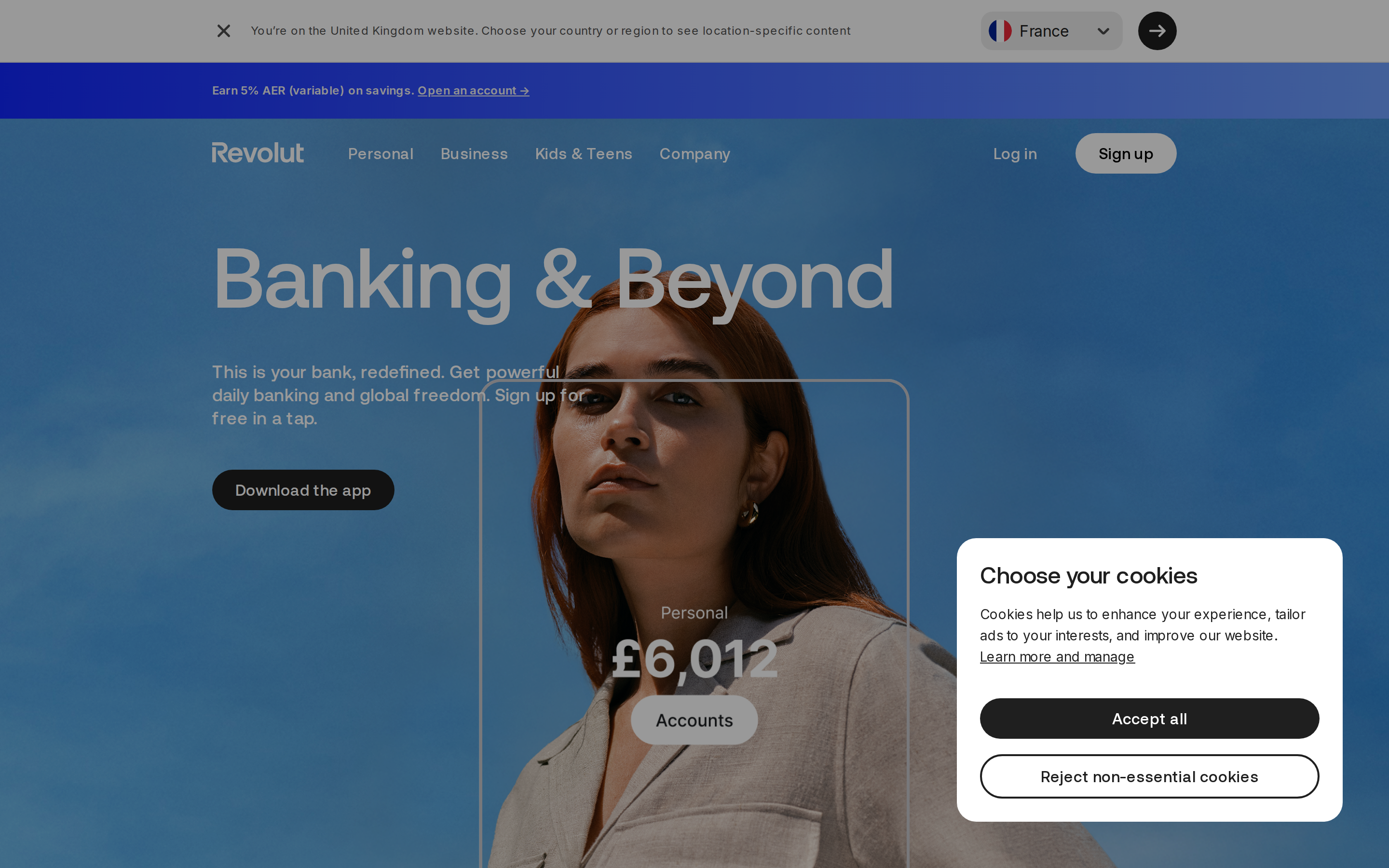
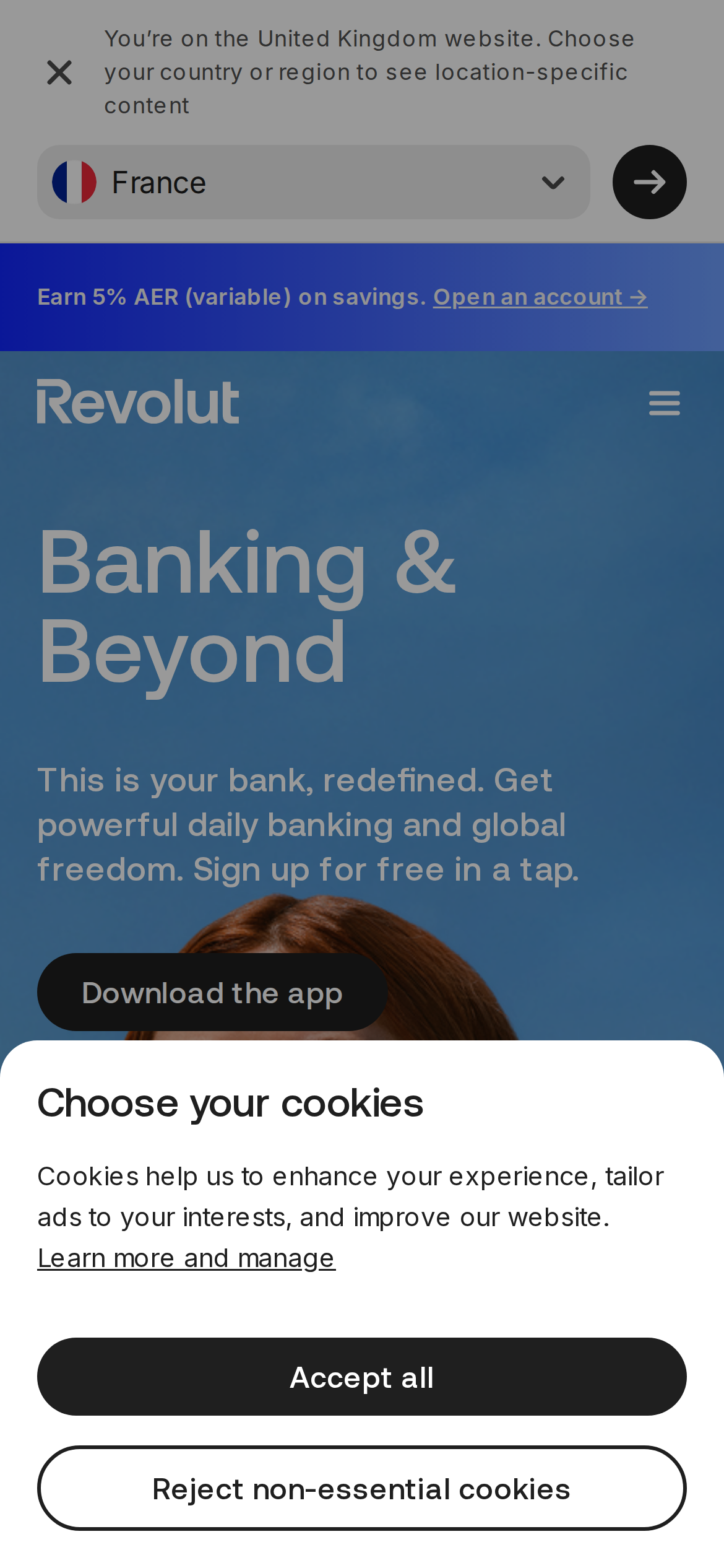
revolut.com is built on a pure-white canvas (rgb(255, 255, 255)). The system uses rgb(31, 31, 31) as the singular interactive color. Moderately rounded CTAs (12px) — modern SaaS standard, neither sharp nor pill alongside Aeonik Pro as the primary typeface. Depth comes from borders and surface contrast rather than shadows — a flat, structural elevation model. Interactions are smoothed by transitions across many elements, with little or no keyframe animation.
Color — roles, semantics & the full census
7 colors measured · click any swatch to copy
3 semantic roles found.
7 colors mined from the live renderexpand
Type — the ladder, in the real face
5 roles · rendered live in the real Inter (captured woff2) · lines are editable, click any spec to copy
Motion — easings, transitions & live keyframes
6 easing curves · 0 keyframes · hover a tile to preview
Transitions only — no @keyframes animation on this page. Motion lives entirely in the easing curves on the left.
Spacing & radius, made spatial
9 spacing steps · 7 radii · bars are exact px widths
0px
12px
20px
22.5px
9999px
10007px
9999px
Components — the closed vocabulary
10 component families · 55 variants counted on the live DOM
| Component | Variants found |
|---|---|
| buttons | ×10 |
| badges | ×10 |
| links | ×10 |
| footer Links | ×7 |
| heading H2 | ×7 |
| nav Links | ×4 |
| tabs | ×3 |
| captions | ×2 |
| heading H1 | ×1 |
| heading H3 | ×1 |
Component style specs (§4)expand
Buttons
Icon Button
- Background:
transparent - Text:
rgba(31, 31, 31, 0.8){colors.hairline} - Padding: 0px
- Radius: 12px
- Font: 16px weight 400
- Use: Toolbar/UI icons
Icon Button
- Background:
#1f1f1f{colors.hairline} - Text:
#ffffff{colors.on-primary} - Padding: 0px 20px
- Radius: 9999px
- Font: 16px weight 400
- Use: Toolbar/UI icons
Pill
- Background:
transparent - Text:
#ffffff{colors.on-primary} - Padding: 8px 10px
- Radius: 9999px
- Font: 16px weight 500
- Use: Status pills, tags, chips
Ghost
- Background:
transparent - Text:
#c9c9cd - Padding: 0px
- Radius: 12px
- Font: 12px weight 400
- Use: Subtle action, toolbar, nav button
Pill
- Background:
transparent - Text:
#1f1f1f{colors.hairline} - Padding: 0px
- Radius: 12px
- Font: 14px weight 400
- Use: Status pills, tags, chips
Tabs
Ghost Tab
- Background:
transparent - Text:
#ffffff{colors.on-primary} - Padding: 0px 20px
- Radius: 0px
- Font: 16px weight 400
- Use: Navigation tabs, filter tabs
Pill Tab
- Background:
#ffffff{colors.on-primary} - Text:
#000000 - Padding: 10px 26px
- Radius: 9999px
- Font: 16px weight 500
- Use: Navigation tabs, filter tabs
Layout — structure & dimensions
4 layout metrics measured
Responsive — real breakpoints
8 media-query stops read from the live CSS
Do's & Don'ts
15 enforceable rules pulled verbatim from the spec
Agent guide & export
Paste-ready prompt + the real files behind this page