storybook.js.org
Accent #5e6ad2 · __Nunito_Sans_ee04dc — every value below measured via getComputedStyle(), not asserted by hand.
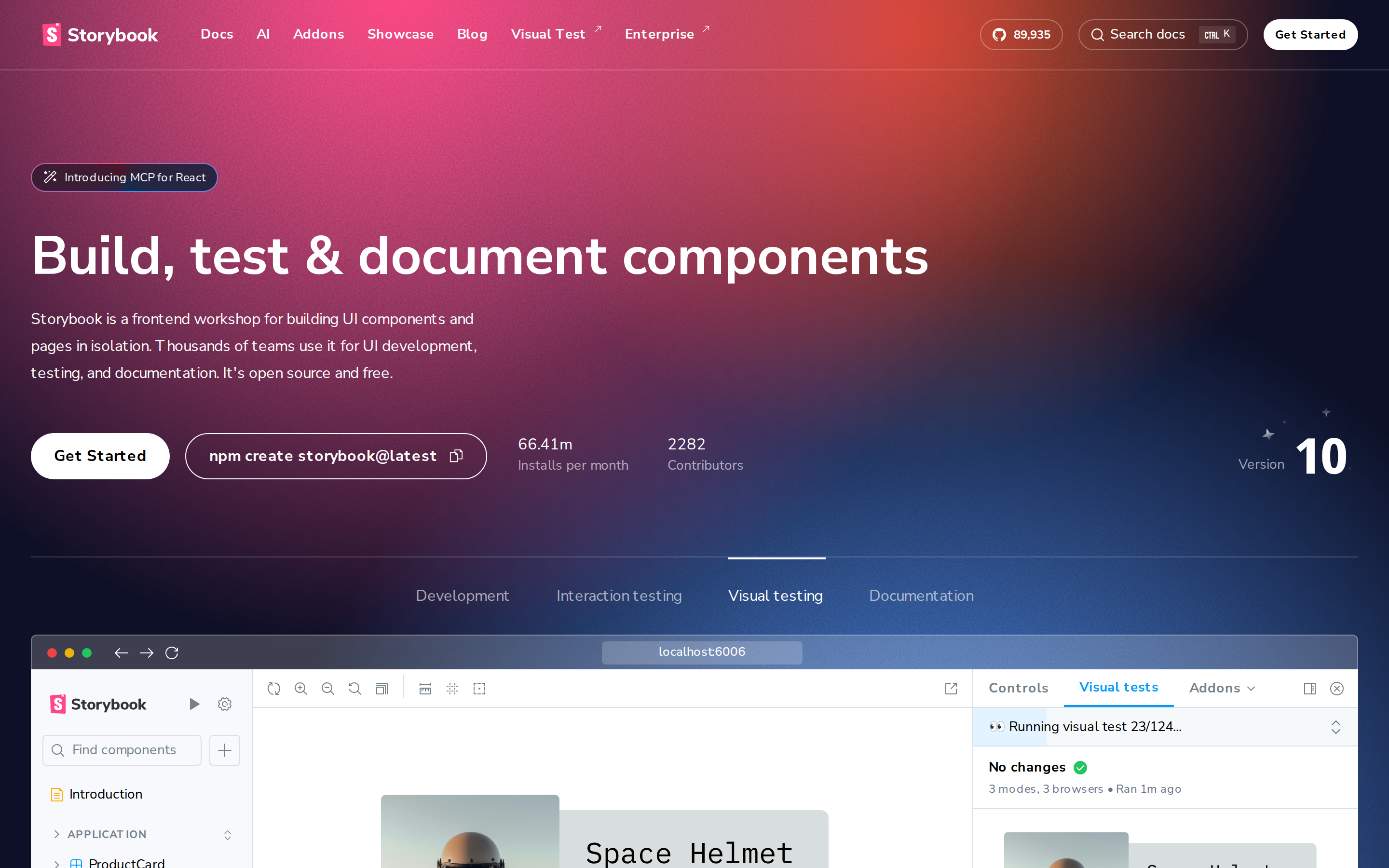
storybook.js.org is built on a pure-white canvas (rgb(255, 255, 255)). The system uses rgb(255, 255, 255) as the singular interactive color. Sharp 0px corners on CTAs — architectural restraint, engineering precision alongside __Nunito_Sans_ee04dc as the primary typeface. A restrained elevation system (3 distinct shadows) — shadows reserved for the few elements that must lift off the page. Motion is a first-class concern — 9 keyframe animations plus transition-driven interactions.
Color — roles, semantics & the full census
78 colors measured · click any swatch to copy
No semantic state colors detected — this system signals state through weight & motion, not hue.
78 colors mined from the live renderexpand
Type — the ladder, in the real face
5 roles · rendered live in the real Inter (captured woff2) · lines are editable, click any spec to copy
Depth — elevation is extracted, not invented
3 box-shadows measured on the live page · click a tile to copy its raw value
Motion — easings, transitions & live keyframes
1 easing curve · 9 keyframes · hover a tile to preview
Spacing & radius, made spatial
9 spacing steps · 7 radii · bars are exact px widths
0px
4px
8px
12px
9999px
10007px
9999px
Components — the closed vocabulary
9 component families · 35 variants counted on the live DOM
| Component | Variants found |
|---|---|
| buttons | ×10 |
| links | ×10 |
| nav Links | ×4 |
| footer Links | ×4 |
| heading H2 | ×3 |
| inputs | ×1 |
| badges | ×1 |
| heading H1 | ×1 |
| heading H3 | ×1 |
Component style specs (§4)expand
Buttons
Pill
- Background:
transparent - Text:
#ffffff{colors.hairline} - Padding: 0px 12px
- Radius: 9999px
- Border: 1px solid rgba(255, 255, 255, 0.3)
- Font: 16px weight 500
- Use: Status pills, tags, chips
- Hover: border:
1px solid rgba(255, 255, 255, 0.32), borderColor:#ffffff - Focus: boxShadow:
rgb(84, 104, 255) 0px 0px 0px 2px inset
Ghost
- Background:
transparent - Text:
#000000 - Padding: 0px 12px
- Radius: 0px
- Font: 16px weight 400
- Use: Subtle action, toolbar, nav button
- Hover: border:
1px solid rgba(255, 255, 255, 0.32), borderColor:#ffffff - Focus: boxShadow:
rgb(84, 104, 255) 0px 0px 0px 2px inset
Ghost
- Background:
transparent - Text:
#ffffff{colors.hairline} - Padding: 0px 8px
- Radius: 6px
- Font: 14px weight 700
- Use: Subtle action, toolbar, nav button
- Hover: border:
1px solid rgba(255, 255, 255, 0.32), borderColor:#ffffff - Focus: boxShadow:
rgb(84, 104, 255) 0px 0px 0px 2px inset
Pill
- Background:
transparent - Text:
#ffffff{colors.hairline} - Padding: 0px 24px
- Radius: 9999px
- Border: 1px solid rgb(255, 255, 255)
- Font: 16px weight 700
- Use: Status pills, tags, chips
- Hover: border:
1px solid rgba(255, 255, 255, 0.32), borderColor:#ffffff - Focus: boxShadow:
rgb(84, 104, 255) 0px 0px 0px 2px inset
Inputs & Forms
Text Input
- Background:
#ffffff{colors.hairline} - Text:
#27272a - Padding: 0px 100px 0px 16px
- Radius: 6px
- Border: 1px solid rgb(228, 228, 231)
- Font: 16px weight 400
- Use: Text fields, search inputs
- Focus: outline:
rgb(16, 16, 16) auto 1px
Layout — structure & dimensions
5 layout metrics measured
Responsive — real breakpoints
16 media-query stops read from the live CSS
Do's & Don'ts
15 enforceable rules pulled verbatim from the spec
Agent guide & export
Paste-ready prompt + the real files behind this page