vuejs.org
Accent #5e6ad2 · Inter var experimental — every value below measured via getComputedStyle(), not asserted by hand.
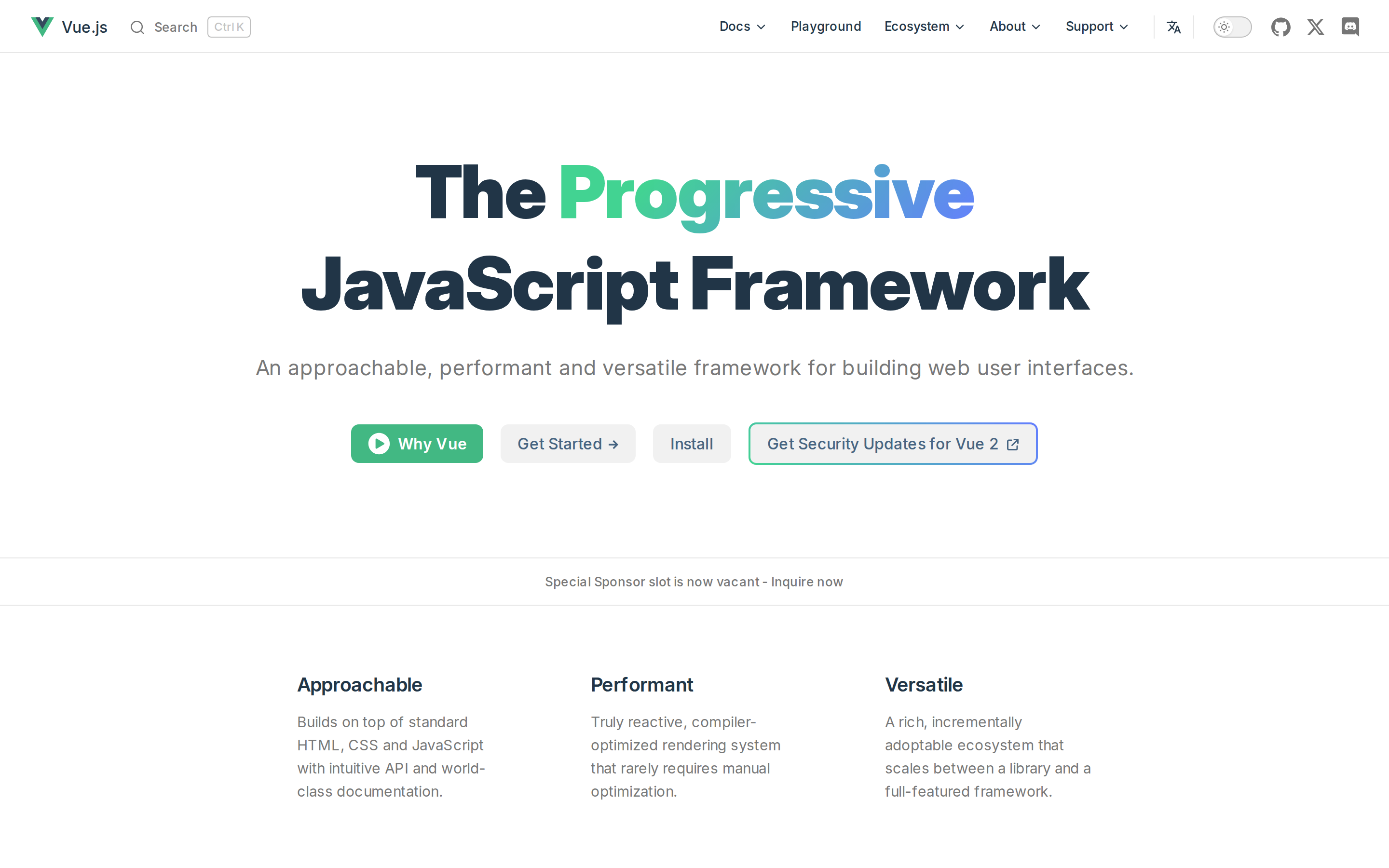
vuejs.org is built on a pure-white canvas (rgb(255, 255, 255)). The system uses rgb(66, 184, 131) as the accent for primary actions and brand signals. Generously rounded CTAs (40px) suggest approachable, content-first design alongside Inter var experimental as the primary typeface. Inter var experimental is paired with Inter var for secondary roles. A restrained elevation system (2 distinct shadows) — shadows reserved for the few elements that must lift off the page. Motion is a first-class concern — 5 keyframe animations plus transition-driven interactions.
Color — roles, semantics & the full census
8 colors measured · click any swatch to copy
No semantic state colors detected — this system signals state through weight & motion, not hue.
8 colors mined from the live renderexpand
Type — the ladder, in the real face
5 roles · rendered live in the real Inter (captured woff2) · lines are editable, click any spec to copy
Depth — elevation is extracted, not invented
2 box-shadows measured on the live page · click a tile to copy its raw value
Motion — easings, transitions & live keyframes
0 easing curves · 5 keyframes · hover a tile to preview
Spacing & radius, made spatial
9 spacing steps · 7 radii · bars are exact px widths
0px
4px
8px
11px
40px
48px
9999px
Components — the closed vocabulary
7 component families · 22 variants counted on the live DOM
| Component | Variants found |
|---|---|
| buttons | ×7 |
| links | ×6 |
| nav Links | ×5 |
| badges | ×1 |
| heading H1 | ×1 |
| heading H2 | ×1 |
| heading H4 | ×1 |
Component style specs (§4)expand
Buttons
Pill
- Background:
transparent - Text:
rgba(60, 60, 60, 0.7){colors.hairline} - Padding: 0px 8px
- Radius: 40px
- Font: 16px weight 500
- Use: Status pills, tags, chips
- Hover: color:
#213547, border:0px none rgb(33, 53, 71), borderColor:#213547 - Focus: color:
rgb(33, 53, 71), border:0px none rgb(33, 53, 71), borderColor:rgb(33, 53, 71)
Ghost
- Background:
transparent - Text:
#213547{colors.ink} - Padding: 0px 12px
- Radius: 0px
- Font: 16px weight 400
- Use: Subtle action, toolbar, nav button
- Hover: color:
#213547, border:0px none rgb(33, 53, 71), borderColor:#213547 - Focus: color:
rgb(33, 53, 71), border:0px none rgb(33, 53, 71), borderColor:rgb(33, 53, 71)
Pill
- Background:
#f1f1f1{colors.surface-1} - Text:
#213547{colors.ink} - Padding: 0px
- Radius: 11px
- Border: 1px solid rgba(60, 60, 60, 0.29)
- Font: 16px weight 400
- Use: Status pills, tags, chips
- Hover: color:
#213547, border:0px none rgb(33, 53, 71), borderColor:#213547 - Focus: color:
rgb(33, 53, 71), border:0px none rgb(33, 53, 71), borderColor:rgb(33, 53, 71)
Light / Invert
- Background:
#ffffff{colors.background} - Text:
#42b883{colors.primary} - Padding: 10.4px 24px
- Radius: 8px
- Shadow:
rgba(0, 0, 0, 0.1) 0px 12px 32px 0px, rgba(0, 0, 0, 0.08) 0px 2px 6px 0px - Font: 14.4px weight 700
- Use: Bright CTA on dark sections
- Hover: color:
#213547, border:0px none rgb(33, 53, 71), borderColor:#213547 - Focus: color:
rgb(33, 53, 71), border:0px none rgb(33, 53, 71), borderColor:rgb(33, 53, 71)
Layout — structure & dimensions
4 layout metrics measured
Responsive — real breakpoints
fluid system — no hard stops
No distinct @media breakpoints captured at the desktop/mobile pass — this layout is fluid, adapting by ratio rather than hard stops.
Do's & Don'ts
20 enforceable rules pulled verbatim from the spec
Agent guide & export
Paste-ready prompt + the real files behind this page