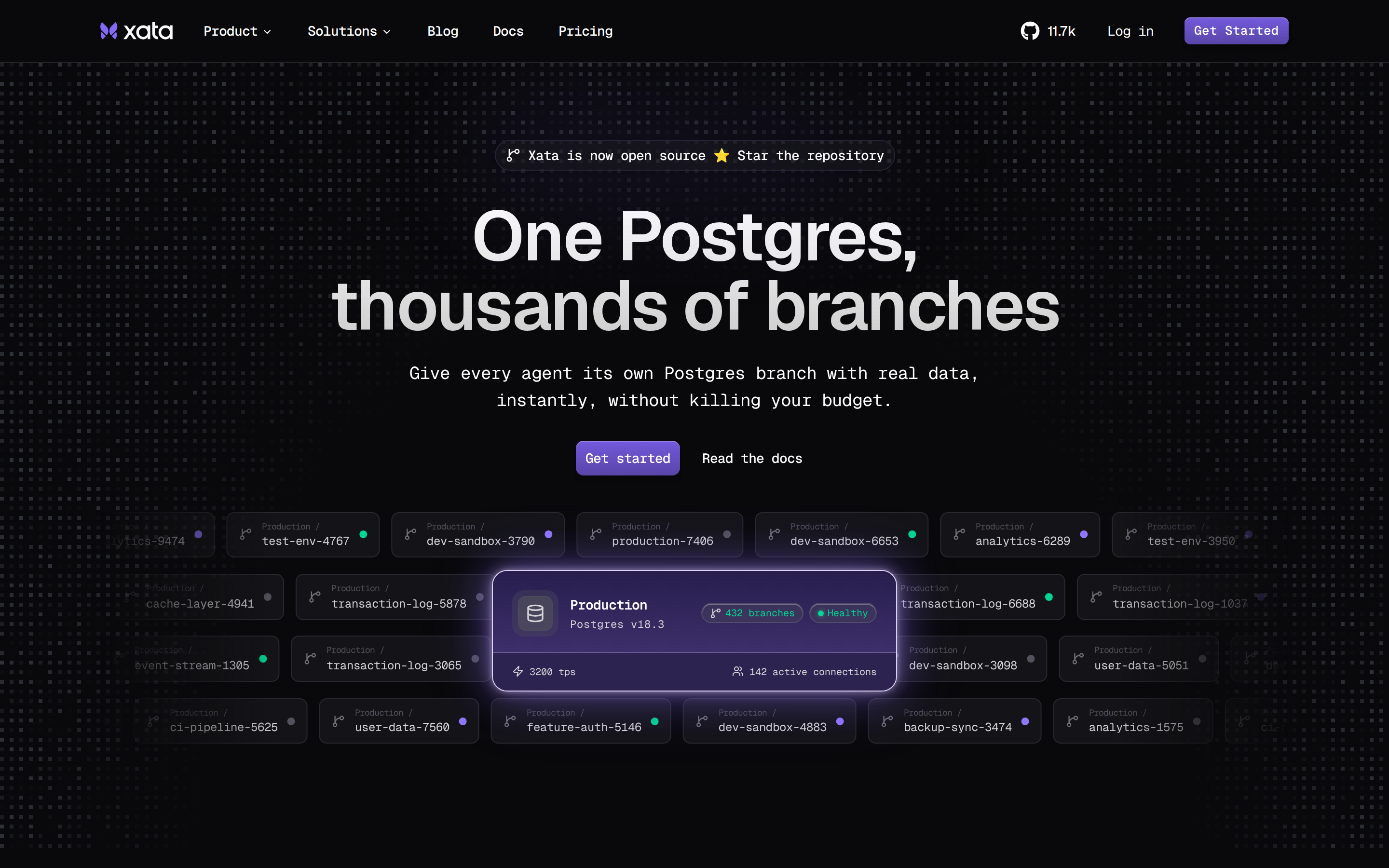
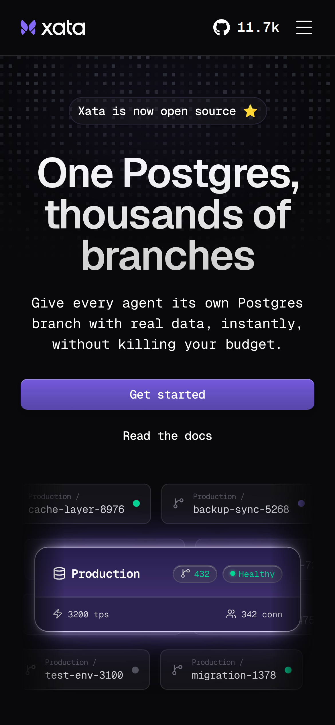
xata.io
Accent #5e6ad2 · GeistMono — every value below measured via getComputedStyle(), not asserted by hand.
xata.io is built on a mid-dark canvas (lab(2.51107 0.242703 -0.886115)). The system uses rgb(39, 39, 42) as a near-neutral accent (low saturation). Geist as the primary typeface. A layered elevation system (15 distinct shadows) building a clear front-to-back hierarchy. Motion is a first-class concern — 32 keyframe animations plus transition-driven interactions.
Color — roles, semantics & the full census
17 colors measured · click any swatch to copy
No semantic state colors detected — this system signals state through weight & motion, not hue.
17 colors mined from the live renderexpand
Type — the ladder, in the real face
6 roles · rendered live in the real Inter (captured woff2) · lines are editable, click any spec to copy
Depth — elevation is extracted, not invented
15 box-shadows measured on the live page · click a tile to copy its raw value
Motion — easings, transitions & live keyframes
3 easing curves · 32 keyframes · hover a tile to preview
Spacing & radius, made spatial
9 spacing steps · 7 radii · bars are exact px widths
0px
calc(.5rem - 4px)
8px
12px
16px
32px
9999px
Components — the closed vocabulary
9 component families · 36 variants counted on the live DOM
| Component | Variants found |
|---|---|
| links | ×10 |
| buttons | ×7 |
| heading H2 | ×6 |
| nav Links | ×5 |
| footer Links | ×4 |
| cta Banner | ×1 |
| heading H1 | ×1 |
| heading H3 | ×1 |
| captions | ×1 |
Component style specs (§4)expand
Buttons
Ghost
- Background:
transparent - Text:
#ffffff{colors.on-primary} - Padding: 8px 16px
- Radius: 6px
- Font: 14px weight 500
- Use: Subtle action, toolbar, nav button
- Hover: color:
#ececee, outline:oklab(0.944349 0.000789192 -0.00264909) none 3px - Focus: color:
oklab(0.999994 0.0000455678 0.0000200868), outline:rgb(16, 16, 16) none 1px
Ghost
- Background:
transparent - Text:
#ffffff{colors.on-primary} - Padding: 0px 10px
- Radius: 6px
- Shadow:
oklab(0.999994 0.0000455678 0.0000200868 / 0.25) 0px 1px 0px 0px inset, oklab(0.... - Font: 12.8px weight 500
- Use: Subtle action, toolbar, nav button
- Hover: color:
#ececee, outline:oklab(0.944349 0.000789192 -0.00264909) none 3px - Focus: color:
oklab(0.999994 0.0000455678 0.0000200868), outline:rgb(16, 16, 16) none 1px
Secondary
- Background:
#27272a{colors.primary} - Text:
#ffffff{colors.on-primary} - Padding: 0px 10px
- Radius: 9999px
- Border: 1px solid lab(15.0806 4.80817 -10.5003)
- Shadow:
oklab(0.141 0.00136173 -0.00480696 / 0.1) 0px 1px 3px 0px, oklab(0.141 0.0013617... - Font: 14px weight 500
- Use: Secondary action
- Hover: color:
#ececee, outline:oklab(0.944349 0.000789192 -0.00264909) none 3px - Focus: color:
oklab(0.999994 0.0000455678 0.0000200868), outline:rgb(16, 16, 16) none 1px
Icon Button
- Background:
#27272a{colors.primary} - Text:
#ffffff{colors.on-primary} - Padding: 0px
- Radius: 6px
- Border: 1px solid lab(15.7305 0.613764 -2.16959)
- Font: 14px weight 500
- Use: Toolbar/UI icons
- Hover: color:
#ececee, outline:oklab(0.944349 0.000789192 -0.00264909) none 3px - Focus: color:
oklab(0.999994 0.0000455678 0.0000200868), outline:rgb(16, 16, 16) none 1px
Secondary
- Background:
#27272a{colors.primary} - Text:
#ffffff{colors.on-primary} - Padding: 0px 10px
- Radius: 8px
- Border: 1px solid lab(15.0806 4.80817 -10.5003)
- Shadow:
oklab(0.141 0.00136173 -0.00480696 / 0.1) 0px 1px 3px 0px, oklab(0.141 0.0013617... - Font: 14px weight 500
- Use: Secondary action
- Hover: color:
#ececee, outline:oklab(0.944349 0.000789192 -0.00264909) none 3px - Focus: color:
oklab(0.999994 0.0000455678 0.0000200868), outline:rgb(16, 16, 16) none 1px
CTA Banners
Layout — structure & dimensions
4 layout metrics measured
Responsive — real breakpoints
1 media-query stops read from the live CSS
Do's & Don'ts
17 enforceable rules pulled verbatim from the spec
Agent guide & export
Paste-ready prompt + the real files behind this page