aman.com
aman.com is built on a warm, off-white canvas (rgb(243, 238, 231)). The system uses rgb(64, 64, 64) as the singular interactive color. Sharp 0px corners on CTAs — architectural restraint, engineering precision alongside Lyon Text Web as the primary typeface. Lyon Text Web is paired with WhitneySSm for secondary roles. Depth comes from borders and surface contrast rather than shadows — a flat, structural elevation model. Motion is a first-class concern — 17 keyframe animations plus transition-driven interactions.
Accent #404040 · police principale Lyon Display Web
Chaque valeur ci-dessous est vérifiée à la capture. getdesign.md décrit — prismd montre : chaque couleur, police et courbe ici a été lue via getComputedStyle() sur le rendu réel capturé à droite, jamais affirmée à la main.
Rapport DESIGN.md complet · light & dark · fichiers tokens · Paiement non activé — on mesure la demande d’abord.
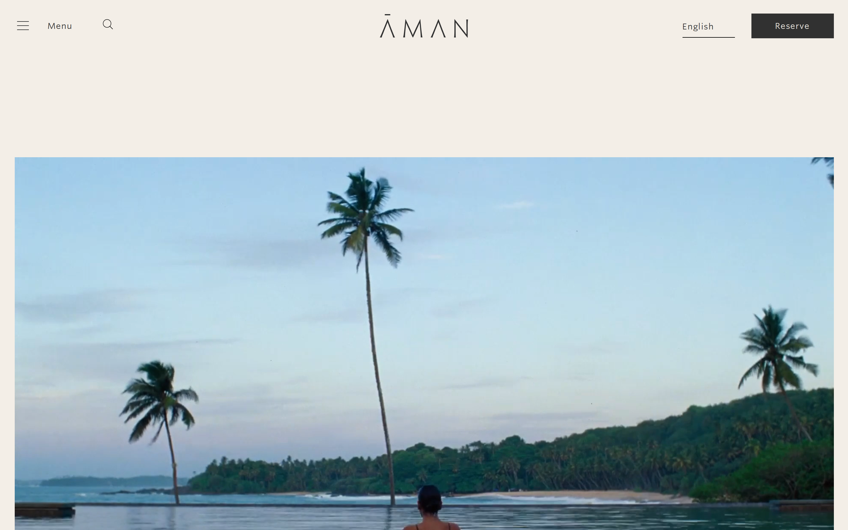
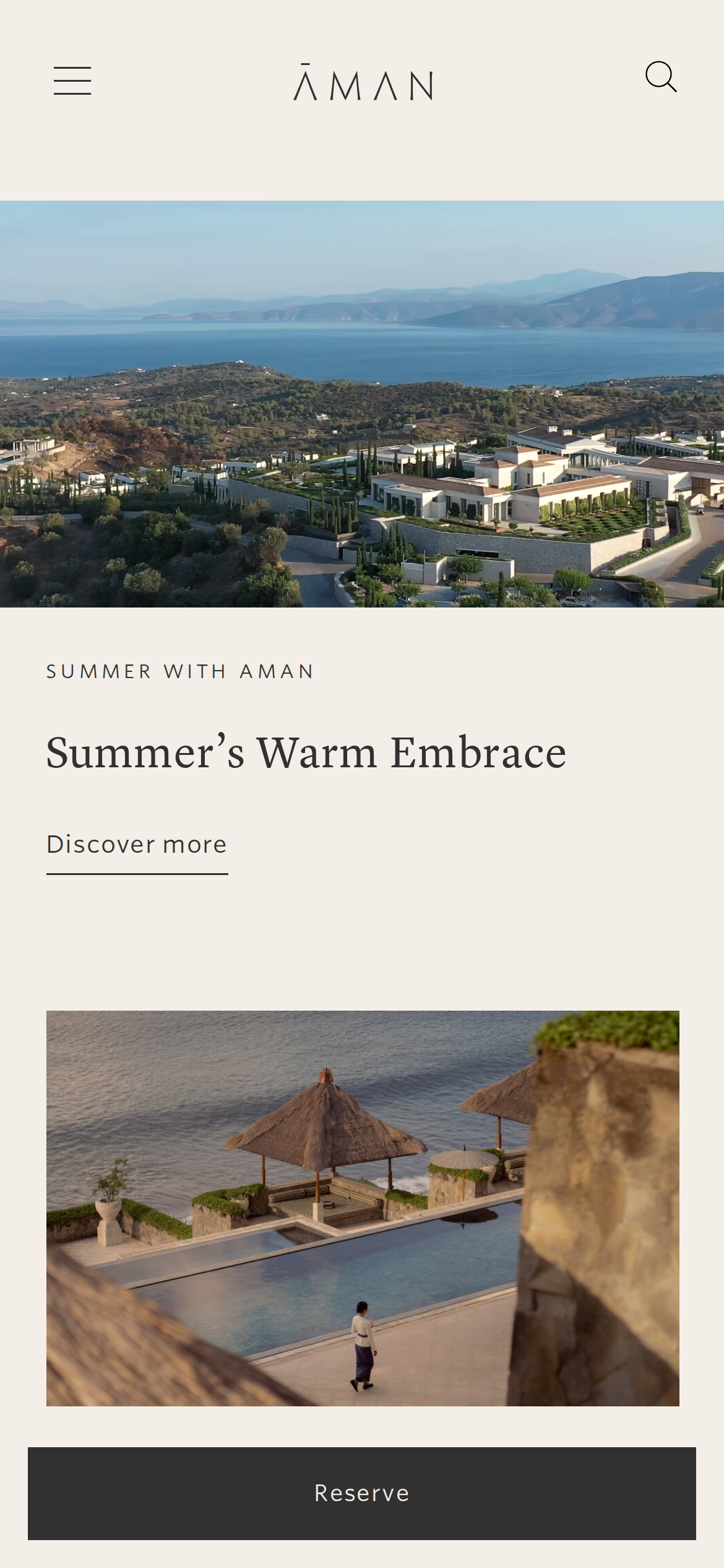
Couleurs — rôles, sémantique & recensement complet
11 couleurs mesurées · clique une pastille pour copier
Aucune couleur d’état sémantique détectée — ce système signale l’état par le poids & le motion, pas la teinte.
11 couleurs extraites du rendu livedéplier
Typographie — l’échelle, dans la vraie police
5 rôles · rendu live dans la vraie Lyon Display Web (woff2 capturé) · lignes éditables, clique une spec pour copier
Espacements & arrondis, rendus spatiaux
9 paliers d’espacement · 7 arrondis · barres = largeurs px exactes
0px
4px
8px
14px
20px
32px
9999px
Motion — courbes, transitions & keyframes réels
1 courbe d’easing · 17 keyframes · survole une tuile pour prévisualiser
Composants — le vocabulaire fermé
12 familles de composants · 41 variantes comptées sur le DOM live
| Composant | Variantes |
|---|---|
| cards | ×10 |
| buttons | ×6 |
| footer Links | ×6 |
| cta Banner | ×5 |
| heading H3 | ×3 |
| badges | ×2 |
| nav Links | ×2 |
| heading H2 | ×2 |
| links | ×2 |
| eyebrow Labels | ×1 |
| captions | ×1 |
| reservation Card | ×1 |
Specs de style des composants (§4)déplier
Buttons
Secondary
- Background:
#313131{colors.hairline} - Text:
#f3eee7{colors.background} - Padding: 10px 15px
- Radius: 0px
- Border: 1px solid rgb(49, 49, 49)
- Font: 14px weight 400
- Use: Secondary action
- Focus: color:
rgb(179, 139, 91), border:0px none rgb(179, 139, 91), borderColor:rgb(179, 139, 91)
Secondary
- Background:
#404040{colors.primary-hover} - Text:
#f3eee7{colors.background} - Padding: 7.392px 33.264px
- Radius: 0px
- Border: 1px solid rgb(64, 64, 64)
- Font: 12.32px weight 400
- Use: Secondary action
- Focus: color:
rgb(179, 139, 91), border:0px none rgb(179, 139, 91), borderColor:rgb(179, 139, 91)
Outline
- Background:
transparent - Text:
#313131{colors.hairline} - Padding: 7.392px 33.264px
- Radius: 0px
- Border: 1px solid rgb(170, 166, 163)
- Font: 12.32px weight 400
- Use: Secondary action with border
- Focus: color:
rgb(179, 139, 91), border:0px none rgb(179, 139, 91), borderColor:rgb(179, 139, 91)
Inputs & Forms
Text Input
- Background:
#ffffff{colors.on-primary} - Text:
#000000 - Padding: 8px 20px 8px 7px
- Radius: 0px
- Border: 1px solid border-color
- Font: 16px weight 400
- Use: Text fields, search inputs
Mise en page — structure & dimensions
5 métriques de layout mesurées
Responsive — vrais breakpoints
20 points de rupture lus dans le CSS live
À faire / À éviter
11 règles applicables, verbatim de la spec
Guide agent & export
Prompt prêt à coller + les vrais fichiers derrière cette page