braerestaurant.com
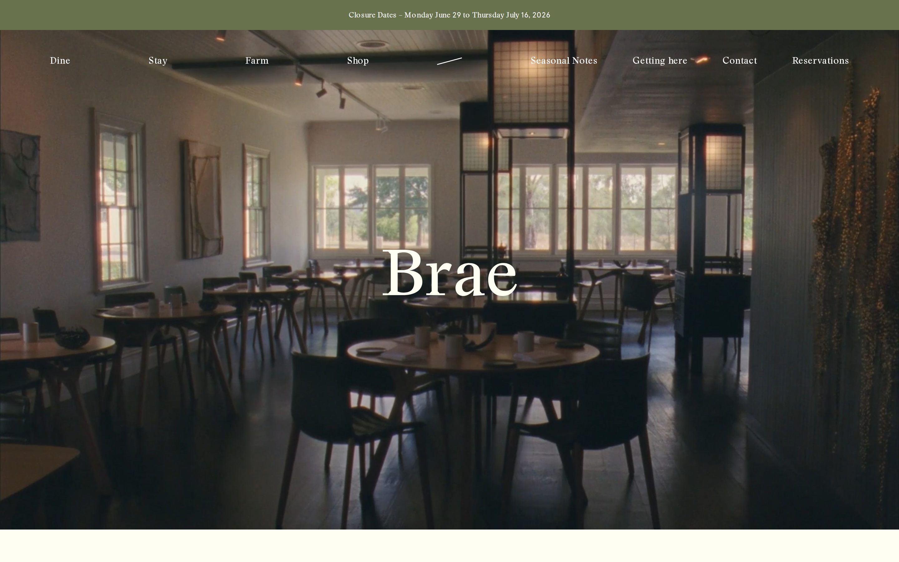
braerestaurant.com is built on a warm, off-white canvas (#FFFEF3). The system uses rgb(104, 114, 77) as the singular interactive color. Crisp CTAs (4px radius) reinforce a precise, technical aesthetic alongside Stanley as the primary typeface. Stanley is paired with Apercu for secondary roles. Depth comes from borders and surface contrast rather than shadows — a flat, structural elevation model. Motion is a first-class concern — 6 keyframe animations plus transition-driven interactions.
Accent #68724d · police principale Stanley
Chaque valeur ci-dessous est vérifiée à la capture. getdesign.md décrit — prismd montre : chaque couleur, police et courbe ici a été lue via getComputedStyle() sur le rendu réel capturé à droite, jamais affirmée à la main.
Rapport DESIGN.md complet · light & dark · fichiers tokens · Paiement non activé — on mesure la demande d’abord.
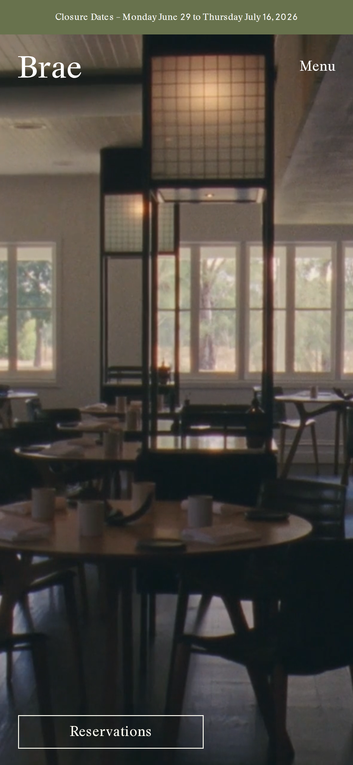
Couleurs — rôles, sémantique & recensement complet
5 couleurs mesurées · clique une pastille pour copier
Aucune couleur d’état sémantique détectée — ce système signale l’état par le poids & le motion, pas la teinte.
Typographie — l’échelle, dans la vraie police
5 rôles · rendu live dans la vraie Stanley (woff2 capturé) · lignes éditables, clique une spec pour copier
Espacements & arrondis, rendus spatiaux
9 paliers d’espacement · 7 arrondis · barres = largeurs px exactes
0px
4px
8px
14px
20px
32px
9999px
Motion — courbes, transitions & keyframes réels
1 courbe d’easing · 6 keyframes · survole une tuile pour prévisualiser
Composants — le vocabulaire fermé
7 familles de composants · 21 variantes comptées sur le DOM live
| Composant | Variantes |
|---|---|
| badges | ×7 |
| links | ×4 |
| inputs | ×3 |
| nav Links | ×2 |
| footer Links | ×2 |
| heading H2 | ×2 |
| buttons | ×1 |
Specs de style des composants (§4)déplier
Buttons
Ghost
- Background:
transparent - Text:
#ffffff{colors.surface-2} - Padding: 0px
- Radius: 4px
- Font: 15px weight 400
- Use: Subtle action, toolbar, nav button
Inputs & Forms
Text Input
- Background:
transparent - Text:
#ffffff{colors.surface-2} - Padding: 16px 0px 12.8px
- Radius: 0px
- Border: 1px solid border-color
- Font: 15.008px weight 400
- Use: Text fields, search inputs
Navigation
Main Nav
- Background:
transparent - Padding: 0px 80px
- Radius: none
- Font: 16px weight 400
- Use: Fixed/sticky flex nav — N/A items
- Hover: opacity:
1
Mise en page — structure & dimensions
5 métriques de layout mesurées
Responsive — vrais breakpoints
2 points de rupture lus dans le CSS live
À faire / À éviter
14 règles applicables, verbatim de la spec
Guide agent & export
Prompt prêt à coller + les vrais fichiers derrière cette page