bun.sh
Accent #5e6ad2 · Roboto — chaque valeur ci-dessous est mesurée via getComputedStyle(), jamais affirmée à la main.
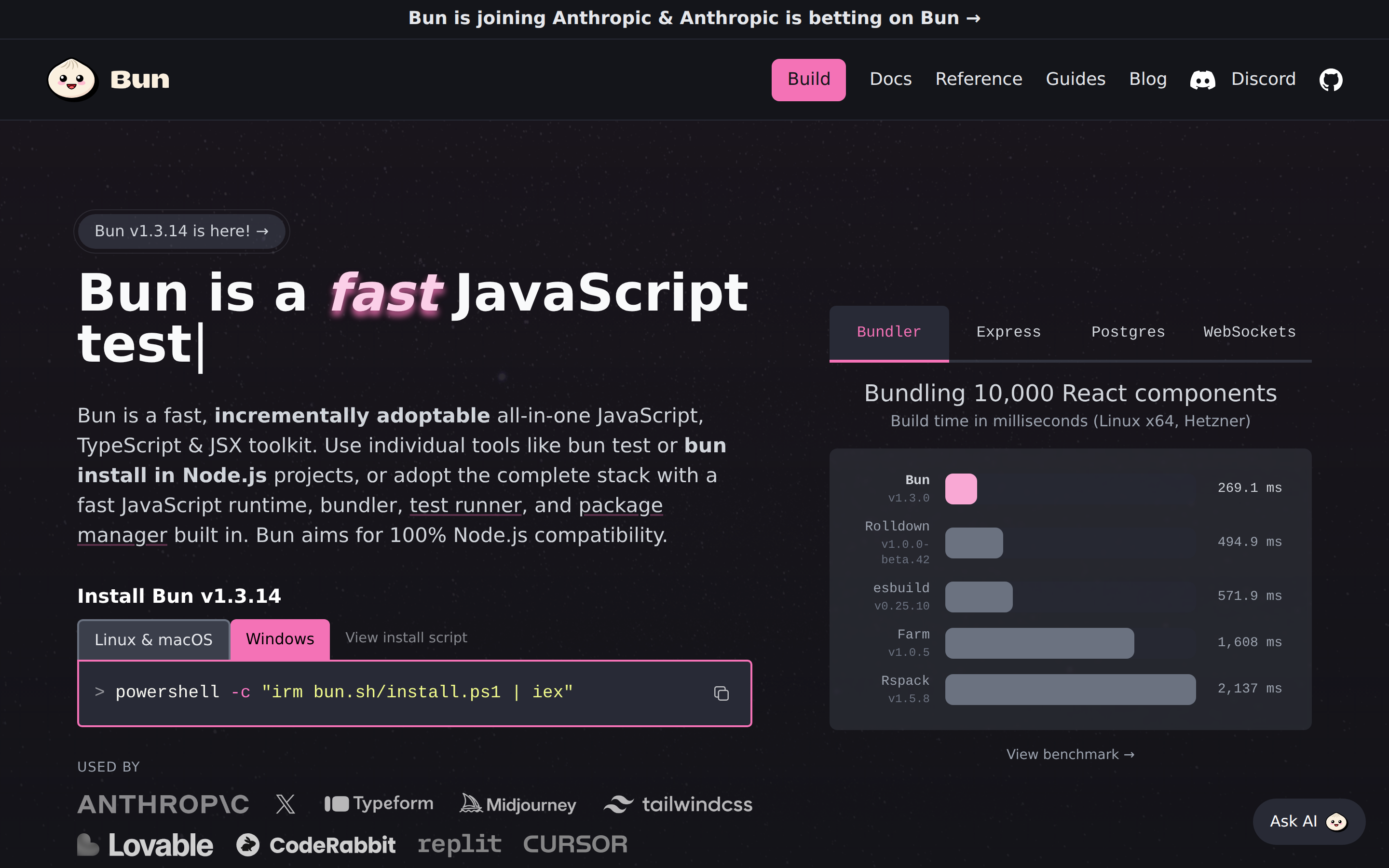
bun.sh is built on a near-black canvas (rgb(20, 21, 26)). The system uses rgb(244, 114, 182) as the accent for primary actions and brand signals. System-ui as the primary typeface. A layered elevation system (7 distinct shadows) building a clear front-to-back hierarchy. Motion is a first-class concern — 13 keyframe animations plus transition-driven interactions.
Color — roles, semantics & the full census
66 colors measured · click any swatch to copy
No semantic state colors detected — this system signals state through weight & motion, not hue.
66 colors mined from the live renderexpand
Type — the ladder, in the real face
6 roles · system fallback — no woff2 captured · lines are editable, click any spec to copy
Spacing & radius, made spatial
9 spacing steps · 7 radii · bars are exact px widths
0px
4px
8px
12px
30px
40px
9999px
Depth — elevation is extracted, not invented
7 box-shadows measured on the live page · click a tile to copy its raw value
Motion — easings, transitions & live keyframes
5 easing curves · 13 keyframes · hover a tile to preview
Components — the closed vocabulary
13 component families · 63 variants counted on the live DOM
| Component | Variants found |
|---|---|
| links | ×10 |
| buttons | ×9 |
| heading H3 | ×8 |
| tooltip | ×7 |
| code Block | ×7 |
| heading H2 | ×6 |
| nav Links | ×5 |
| footer Links | ×4 |
| tabs | ×3 |
| inputs | ×1 |
| heading H1 | ×1 |
| heading H4 | ×1 |
| alert | ×1 |
Component style specs (§4)expand
Buttons
Dark / Solid
- Background:
#090a11 - Text:
#7f8497 - Padding: 0px 8px
- Radius: 40px
- Font: 16px weight 500
- Use: Solid dark CTA
Ghost
- Background:
transparent - Text:
#d1d5db{colors.ink-muted} - Padding: 8px 4px
- Radius: 6px
- Font: 16px weight 400
- Use: Subtle action, toolbar, nav button
Primary Brand
- Background:
#f472b6{colors.primary} - Text:
#14151a{colors.surface-2} - Padding: 8px 16px
- Radius: 8px
- Font: 18px weight 500
- Use: Primary CTA / brand action
Pill
- Background:
#282a35 - Text:
#ffffff{colors.hairline} - Padding: 12px 18px
- Radius: 9999px
- Font: 16px weight 500
- Use: Status pills, tags, chips
Secondary
- Background:
#3b3f4b - Text:
#e5e7eb - Padding: 8px 16px
- Radius: 6px 6px 0px 0px
- Font: 16px weight 400
- Use: Secondary action
Secondary
- Background:
#282a36 - Text:
#f472b6{colors.primary} - Padding: 16px
- Radius: 7px 7px 0px 0px
- Font: 16px weight 400
- Use: Secondary action
Ghost
- Background:
transparent - Text:
#d1d5db{colors.ink-muted} - Padding: 16px
- Radius: 7px 7px 0px 0px
- Font: 16px weight 400
- Use: Subtle action, toolbar, nav button
Inputs & Forms
Layout — structure & dimensions
5 layout metrics measured
Responsive — real breakpoints
8 media-query stops read from the live CSS
Do's & Don'ts
18 enforceable rules pulled verbatim from the spec
Agent guide & export
Paste-ready prompt + the real files behind this page