opencode.ai
Accent #5e6ad2 · Berkeley Mono — chaque valeur ci-dessous est mesurée via getComputedStyle(), jamais affirmée à la main.
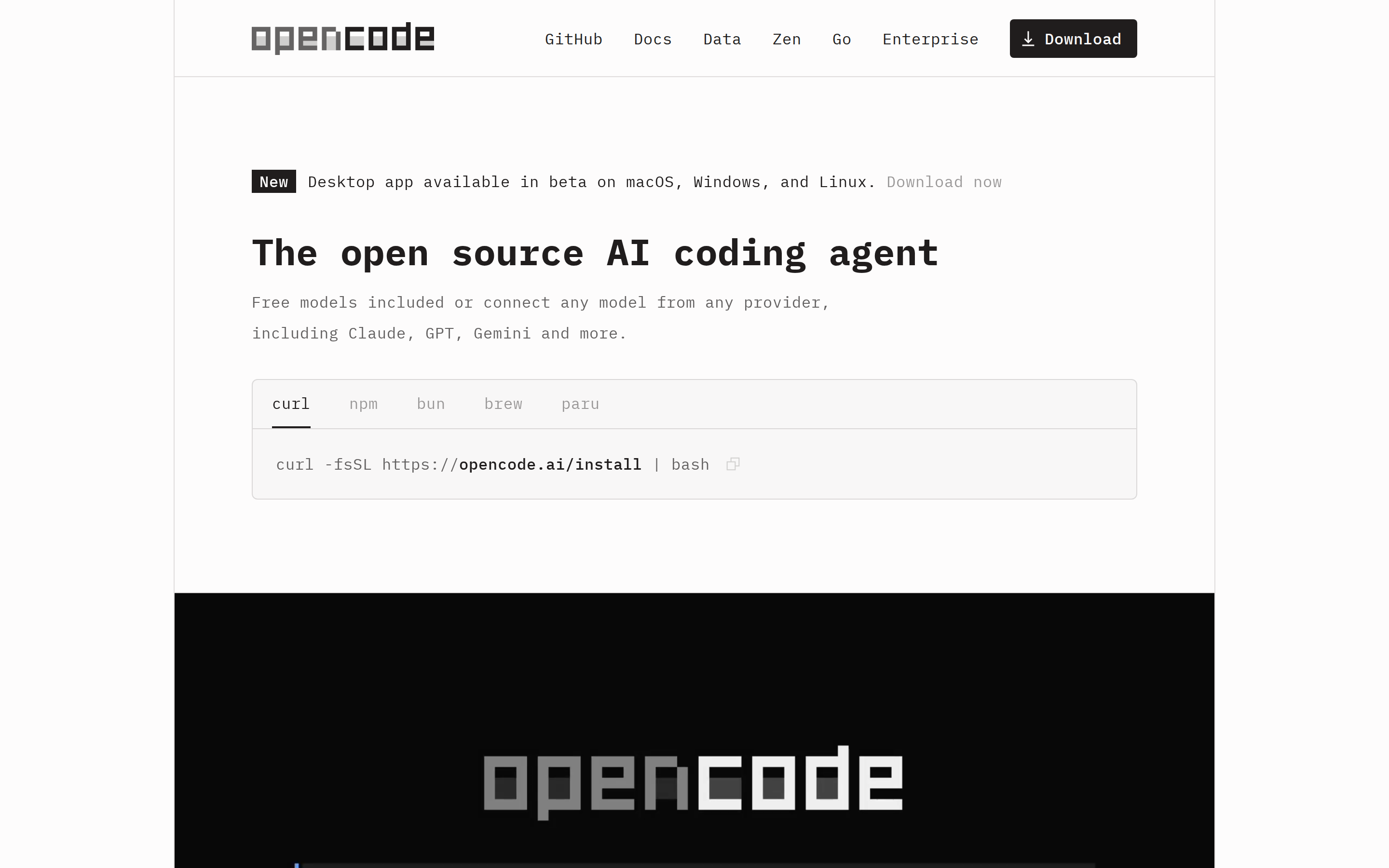
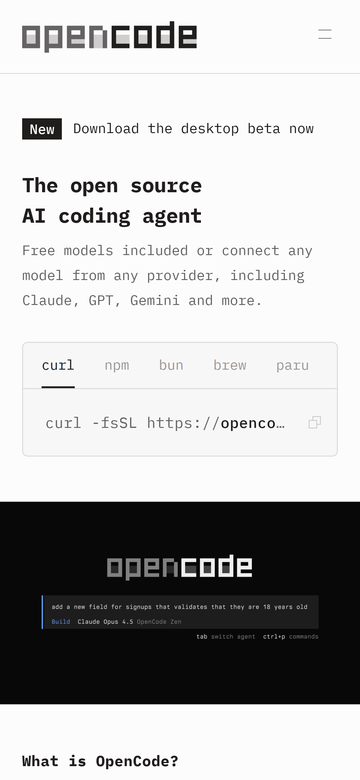
opencode.ai is built on a mid-dark canvas (hsl(0, 20%, 99%)). The system uses rgb(32, 29, 29) as a near-neutral accent (low saturation). Sharp 0px corners on CTAs — architectural restraint, engineering precision alongside monospace typography (Berkeley Mono) — developer-first identity. Berkeley Mono is paired with IBM Plex Mono for secondary roles. Depth comes from borders and surface contrast rather than shadows — a flat, structural elevation model. Motion is minimal — a few targeted transitions, no decorative animation.
Color — roles, semantics & the full census
15 colors measured · click any swatch to copy
3 semantic roles found.
15 colors mined from the live renderexpand
Type — the ladder, in the real face
4 roles · rendered live in the real Inter (captured woff2) · lines are editable, click any spec to copy
Spacing & radius, made spatial
9 spacing steps · 7 radii · bars are exact px widths
0px
4px
6px
14px
20px
32px
9999px
Components — the closed vocabulary
9 component families · 24 variants counted on the live DOM
| Component | Variants found |
|---|---|
| links | ×7 |
| buttons | ×6 |
| tabs | ×4 |
| nav Links | ×2 |
| inputs | ×1 |
| footer Links | ×1 |
| heading H1 | ×1 |
| heading H3 | ×1 |
| code Block | ×1 |
Component style specs (§4)expand
Buttons
Ghost
- Background:
transparent - Text:
#000000 - Padding: 1px 6px
- Radius: 0px
- Font: 16px weight 400
- Use: Subtle action, toolbar, nav button
Ghost
- Background:
transparent - Text:
#201d1d{colors.primary} - Padding: 16px 0px
- Radius: 0px
- Font: 16px weight 400
- Use: Subtle action, toolbar, nav button
Secondary
- Background:
#201d1d{colors.primary} - Text:
#fdfcfc{colors.surface-1} - Padding: 4px 20px
- Radius: 4px
- Font: 16px weight 500
- Use: Secondary action
Secondary
- Background:
#201d1d{colors.primary} - Text:
#fdfcfc{colors.surface-1} - Padding: 8px 16px 8px 10px
- Radius: 4px
- Font: 16px weight 500
- Use: Secondary action
Secondary
- Background:
#201d1d{colors.primary} - Text:
#fdfcfc{colors.surface-1} - Padding: 8px 12px 8px 20px
- Radius: 4px
- Font: 16px weight 500
- Use: Secondary action
Light / Invert
- Background:
#fdfcfc{colors.surface-1} - Text:
#201d1d{colors.primary} - Padding: 8px 12px 8px 20px
- Radius: 4px
- Border: 1px solid rgba(15, 0, 0, 0.12)
- Font: 16px weight 500
- Use: Bright CTA on dark sections
Inputs & Forms
Text Input
- Background:
#f8f7f7{colors.surface-2} - Text:
#201d1d{colors.primary} - Padding: 20px
- Radius: 6px
- Border: 1px solid rgba(15, 0, 0, 0.12)
- Font: 16px weight 400
Layout — structure & dimensions
5 layout metrics measured
Responsive — real breakpoints
fluid system — no hard stops
No distinct @media breakpoints captured at the desktop/mobile pass — this layout is fluid, adapting by ratio rather than hard stops.
Do's & Don'ts
19 enforceable rules pulled verbatim from the spec
Agent guide & export
Paste-ready prompt + the real files behind this page