uber.com
Accent #5e6ad2 · UberMoveText — chaque valeur ci-dessous est mesurée via getComputedStyle(), jamais affirmée à la main.
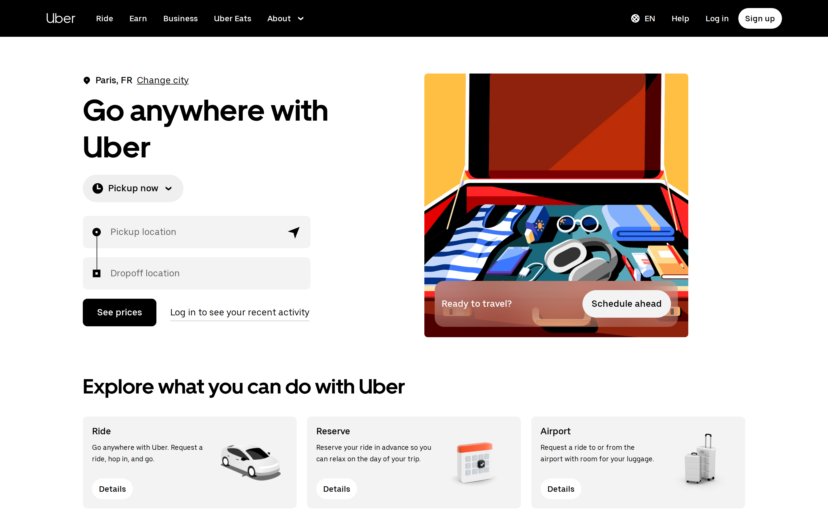
uber.com is built on a pure-white canvas (rgb(255,255,255)). The system uses rgb(255, 255, 255) as the singular interactive color. Fully-rounded CTAs (999px) signal a friendly, tactile interaction model alongside UberMove as the primary typeface. A restrained elevation system (3 distinct shadows) — shadows reserved for the few elements that must lift off the page. Interactions are smoothed by transitions across many elements, with little or no keyframe animation.
Color — roles, semantics & the full census
15 colors measured · click any swatch to copy
3 semantic roles found.
15 colors mined from the live renderexpand
Type — the ladder, in the real face
5 roles · rendered live in the real Inter (captured woff2) · lines are editable, click any spec to copy
Spacing & radius, made spatial
9 spacing steps · 7 radii · bars are exact px widths
0px
6px
8px
12px
16px
999px
999px
Depth — elevation is extracted, not invented
3 box-shadows measured on the live page · click a tile to copy its raw value
Motion — easings, transitions & live keyframes
3 easing curves · 1 keyframes · hover a tile to preview
Components — the closed vocabulary
9 component families · 30 variants counted on the live DOM
| Component | Variants found |
|---|---|
| buttons | ×10 |
| footer Links | ×8 |
| heading H2 | ×4 |
| nav Links | ×2 |
| links | ×2 |
| inputs | ×1 |
| heading H1 | ×1 |
| heading H3 | ×1 |
| date Picker | ×1 |
Component style specs (§4)expand
Buttons
Pill
- Background:
#000000 - Text:
#ffffff{colors.primary} - Padding: 10px 12px
- Radius: 999px
- Font: 14px weight 500
- Use: Status pills, tags, chips
- Hover: boxShadow:
rgba(255, 255, 255, 0.1) 999px 999px 0px 0px inset - Focus: boxShadow:
rgb(255, 255, 255) 0px 0px 0px 2px inset, rgb(39, 110, 241)
Ghost
- Background:
transparent - Text:
#000000 - Padding: 0px
- Radius: 8px
- Font: 16px weight 400
- Use: Subtle action, toolbar, nav button
- Hover: boxShadow:
rgba(255, 255, 255, 0.1) 999px 999px 0px 0px inset - Focus: boxShadow:
rgb(255, 255, 255) 0px 0px 0px 2px inset, rgb(39, 110, 241)
Ghost
- Background:
#000000 - Text:
#ffffff{colors.primary} - Padding: 14px 25px
- Radius: 8px
- Font: 16px weight 500
- Use: Subtle action, toolbar, nav button
- Hover: boxShadow:
rgba(255, 255, 255, 0.1) 999px 999px 0px 0px inset - Focus: boxShadow:
rgb(255, 255, 255) 0px 0px 0px 2px inset, rgb(39, 110, 241)
Pill
- Background:
#000000 - Text:
#ffffff{colors.primary} - Padding: 8px
- Radius: 999px
- Font: 14px weight 500
- Use: Status pills, tags, chips
- Hover: boxShadow:
rgba(255, 255, 255, 0.1) 999px 999px 0px 0px inset - Focus: boxShadow:
rgb(255, 255, 255) 0px 0px 0px 2px inset, rgb(39, 110, 241)
Inputs & Forms
Text Input
- Background:
transparent - Text:
#000000 - Padding: 10px 14px 10px 48px
- Radius: 0px
- Border: 0px none rgb(118, 118, 118)
- Font: 16px weight 400
- Use: Text fields, search inputs
Navigation
Main Nav
- Background:
#000000 - Padding: 12px 0px
- Radius: none
- Font: 16px weight 400
Layout — structure & dimensions
4 layout metrics measured
Responsive — real breakpoints
7 media-query stops read from the live CSS
Do's & Don'ts
16 enforceable rules pulled verbatim from the spec
Agent guide & export
Paste-ready prompt + the real files behind this page