jobirl.com
Accent #5e6ad2 · Montserrat — chaque valeur ci-dessous est mesurée via getComputedStyle(), jamais affirmée à la main.
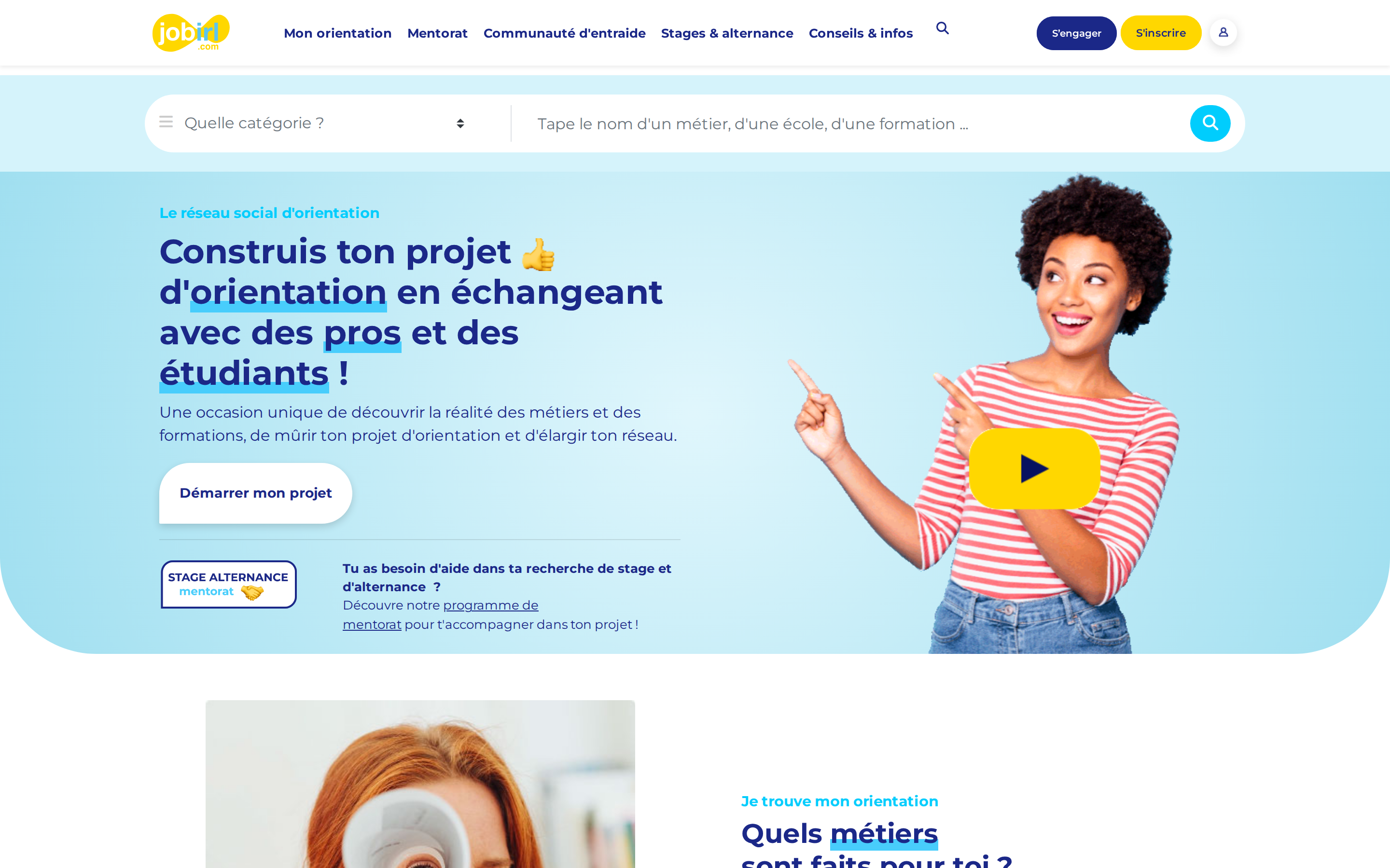
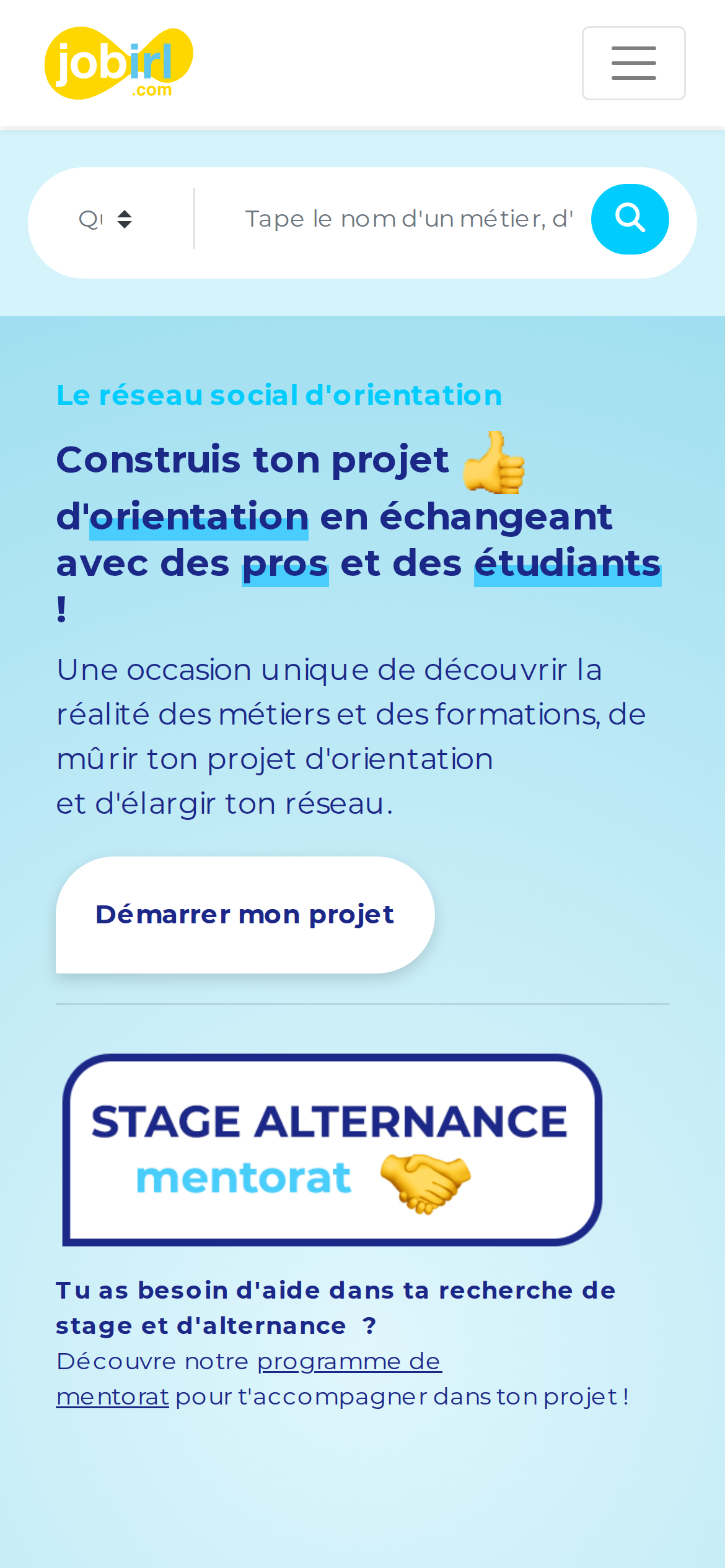
jobirl.com is built on a pure-white canvas (rgb(255, 255, 255)). The system uses rgb(27, 40, 136) as the accent for primary actions and brand signals. Sharp 0px corners on CTAs — architectural restraint, engineering precision alongside Montserrat as the primary typeface. Montserrat is paired with Font Awesome 6 Free for secondary roles. A restrained elevation system (3 distinct shadows) — shadows reserved for the few elements that must lift off the page. Motion is a first-class concern — 22 keyframe animations plus transition-driven interactions.
Color — roles, semantics & the full census
17 colors measured · click any swatch to copy
4 semantic roles found.
17 colors mined from the live renderexpand
Type — the ladder, in the real face
6 roles · rendered live in the real Inter (captured woff2) · lines are editable, click any spec to copy
Spacing & radius, made spatial
9 spacing steps · 7 radii · bars are exact px widths
0px
4px
10px
30px
50px
58px
9999px
Depth — elevation is extracted, not invented
3 box-shadows measured on the live page · click a tile to copy its raw value
Motion — easings, transitions & live keyframes
1 easing curve · 22 keyframes · hover a tile to preview
Components — the closed vocabulary
10 component families · 45 variants counted on the live DOM
| Component | Variants found |
|---|---|
| buttons | ×8 |
| heading H3 | ×7 |
| cards | ×6 |
| nav Links | ×6 |
| links | ×6 |
| heading H2 | ×5 |
| footer Links | ×3 |
| inputs | ×2 |
| badges | ×1 |
| heading H1 | ×1 |
Component style specs (§4)expand
Buttons
Outline
- Background:
transparent - Text:
rgba(0, 0, 0, 0.5) - Padding: 4px 12px
- Radius: 4px
- Border: 1px solid rgba(0, 0, 0, 0.1)
- Font: 20px weight 400
- Use: Secondary action with border
- Focus: outline:
rgb(129, 129, 129) dotted 3px
Ghost
- Background:
transparent - Text:
#818181{colors.primary-focus} - Padding: 8px
- Radius: 0px
- Font: 60px weight 400
- Use: Subtle action, toolbar, nav button
- Focus: outline:
rgb(129, 129, 129) dotted 3px
Ghost
- Background:
transparent - Text:
#1b2888{colors.primary} - Padding: 8px
- Radius: 0px
- Font: 13px weight 700
- Use: Subtle action, toolbar, nav button
- Focus: outline:
rgb(129, 129, 129) dotted 3px
Pill
- Background:
#1b2888{colors.primary} - Text:
#ffffff{colors.on-primary} - Padding: 10px 15px
- Radius: 30px
- Border: 1px solid rgb(27, 40, 136)
- Font: 10px weight 600
- Use: Status pills, tags, chips
- Focus: outline:
rgb(129, 129, 129) dotted 3px
Pill
- Background:
#ffd700{colors.primary-hover} - Text:
#1b2888{colors.primary} - Padding: 10px 15px
- Radius: 30px
- Border: 1px solid rgb(255, 215, 0)
- Font: 11px weight 600
- Use: Status pills, tags, chips
- Focus: outline:
rgb(129, 129, 129) dotted 3px
Inputs & Forms
Text Input
- Background:
transparent - Text:
#495057 - Padding: 6px 12px
- Radius: 4px
- Border: 0px none rgb(73, 80, 87)
- Font: 16px weight 400
- Use: Text fields, search inputs
Layout — structure & dimensions
4 layout metrics measured
Responsive — real breakpoints
15 media-query stops read from the live CSS
Do's & Don'ts
17 enforceable rules pulled verbatim from the spec
Agent guide & export
Paste-ready prompt + the real files behind this page