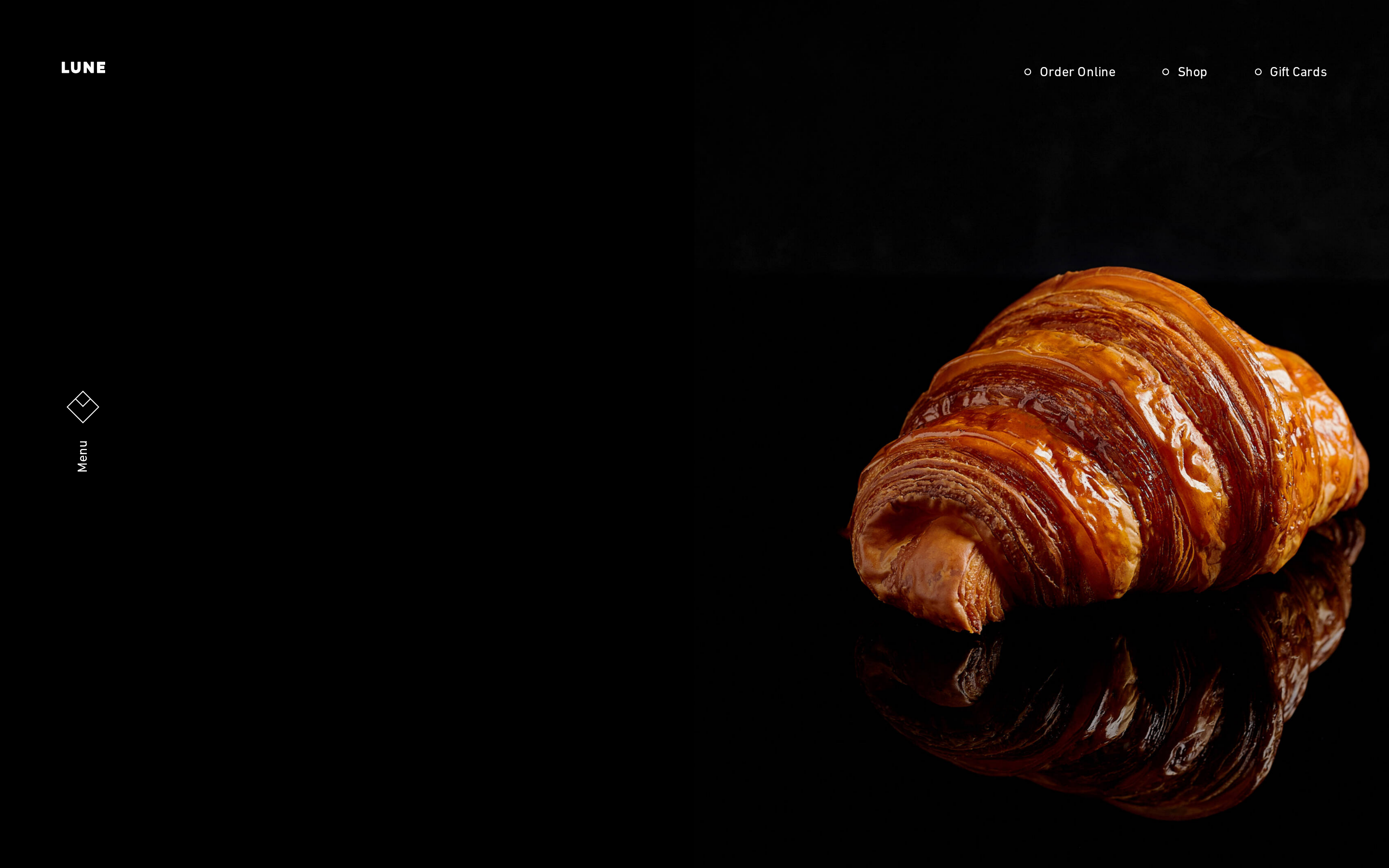
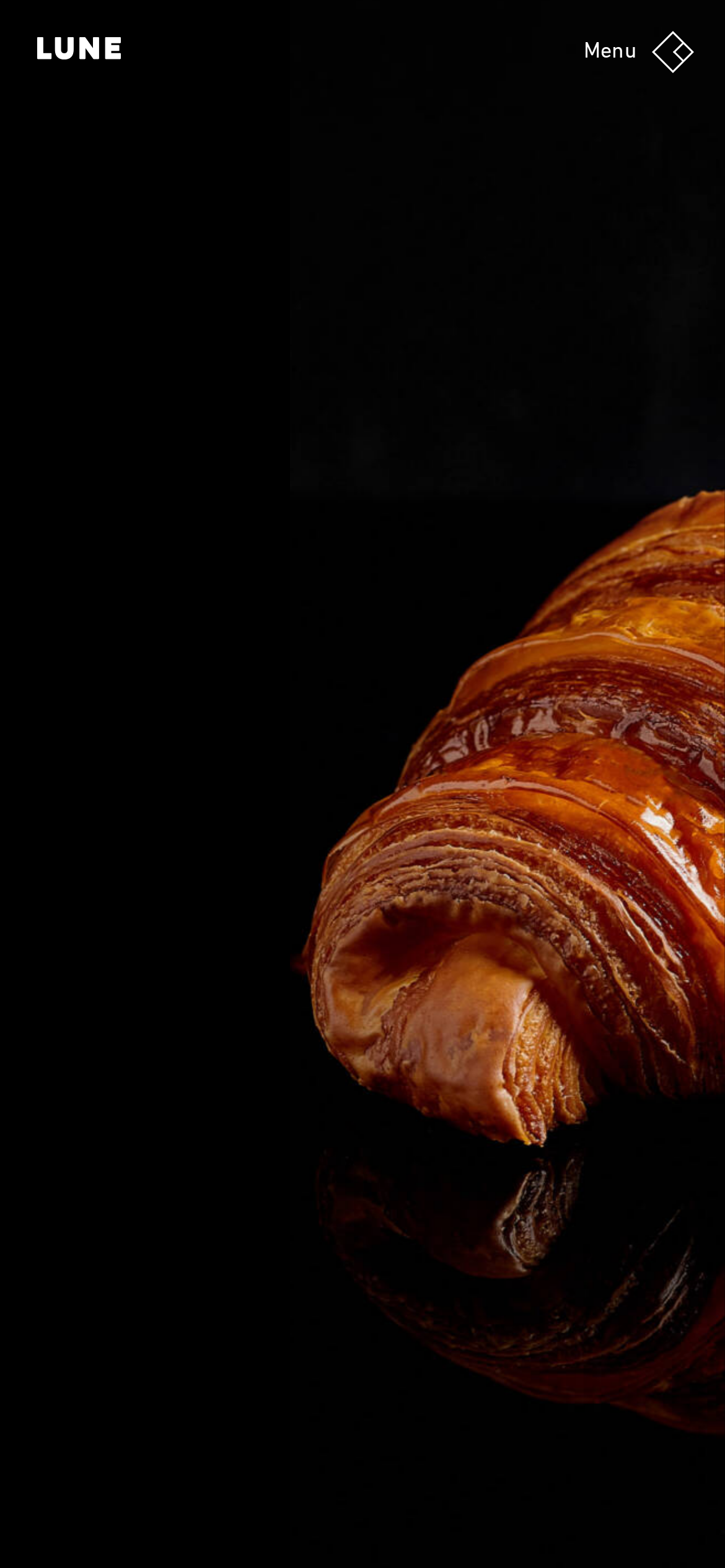
lunecroissanterie.com is built on a near-black canvas (rgb(0, 0, 0)).
Sharp 0px corners on CTAs — architectural restraint, engineering precision alongside DIN Next LT W01 Bold as the primary typeface.
DIN Next LT W01 Bold is paired with DIN Next LT W01 Regular for secondary roles.
Depth comes from borders and surface contrast rather than shadows — a flat, structural elevation model.
Motion is a first-class concern — 13 keyframe animations plus transition-driven interactions.
Accent #cf7a33 · police principale Untitled Sans
Chaque valeur ci-dessous est vérifiée à la capture. getdesign.md décrit — prismd montre : chaque couleur, police et courbe ici a été lue via getComputedStyle() sur le rendu réel capturé à droite, jamais affirmée à la main.
Rapport DESIGN.md complet · light & dark · fichiers tokens · Paiement non activé — on mesure la demande d’abord.
2 courbes d’easing · 13 keyframes · survole une tuile pour prévisualiser
Courbes & transitions
transition-1linear
transition-3cubic-bezier(0.47, 0, 0.745, 0.715)
13 animations keyframes extraites
show-content-image
turn-on-visibility
turn-off-visibility
lightbox-zoom-in
lightbox-zoom-out
overlay-menu__fade-in-animation
ani-sound-wave
slideAnimationOrder
slideAnimationNow
iti-spinner
iti-strict-reject-shake
iti-strict-reject-flash
06
Composants — le vocabulaire fermé
5 familles de composants · 18 variantes comptées sur le DOM live
Composant
Variantes
links
×10
buttons
×3
nav Links
×2
heading H3
×2
badges
×1
07
Mise en page — structure & dimensions
5 métriques de layout mesurées
max Width1200px
header Height64px
sidebar Width0px
gap16px
container Padding24px
08
Responsive — vrais breakpoints
12 points de rupture lus dans le CSS live
35px
47px
60px
65px
80px
500px
520px
600px
640px
680px
781px
782px
09
À faire / À éviter
16 règles applicables, verbatim de la spec
À faire
Use dark background (`#000000`) as the foundation — this is a dark-mode-native design
Use Near-Black (`#222222`) for text — not pure black, it's warmer and more readable
Use Untitled Sans as the primary typeface — it defines the brand personality
The system uses a single text weight (400) — hierarchy comes from size and color, not weight
Use negative letter-spacing (-5.76px) at display sizes for compressed, editorial headlines
Keep navigation fixed to the top — the design uses a persistent navigation pattern
Make the navigation fixed — it stays visible during scroll, signaling content depth
Each card includes a top image — imagery is part of the card identity, not optional
Use a 4-column grid on desktop — density matters for this content type
À éviter
Don't use light backgrounds — the dark canvas is the native medium
Don't use pure black (`#000000`) for text — the near-black adds warmth
Don't substitute with generic sans-serif or serif — the custom font carries the brand
Don't introduce bolder or lighter weights — 400 is the only weight in this system
Don't increase letter-spacing on headings — the type is designed to run tight at scale
Don't put a CTA button in the nav — this design uses links only at the top
Don't over-build the footer — this design keeps it minimal (2 cols, 2 links)
10
Guide agent & export
Prompt prêt à coller + les vrais fichiers derrière cette page
Construis une UI dans le design system de lunecroissanterie.com.
Fond #0e0e10 · encre #ffffff · accent #cf7a33.
Typo : Untitled Sans — respecte l’échelle taille/graisse du §3.
Arrondis, espacements, ombres : uniquement les échelles extraites (aucun nombre magique).
La spec complète suit — colle le DESIGN.md ci-dessous dans ton agent.
Chaque valeur ci-dessus est vérifiée par getComputedStyle.