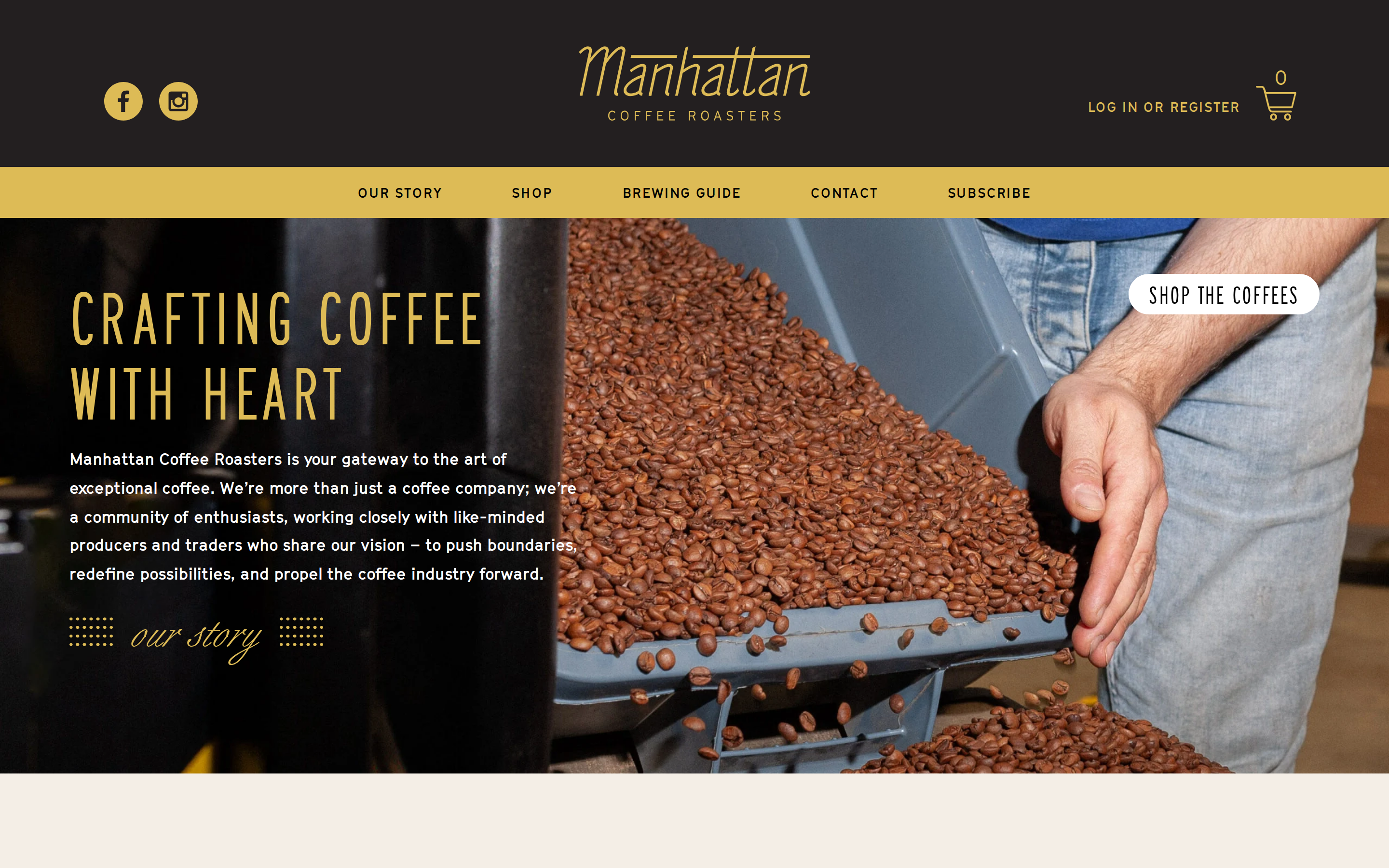
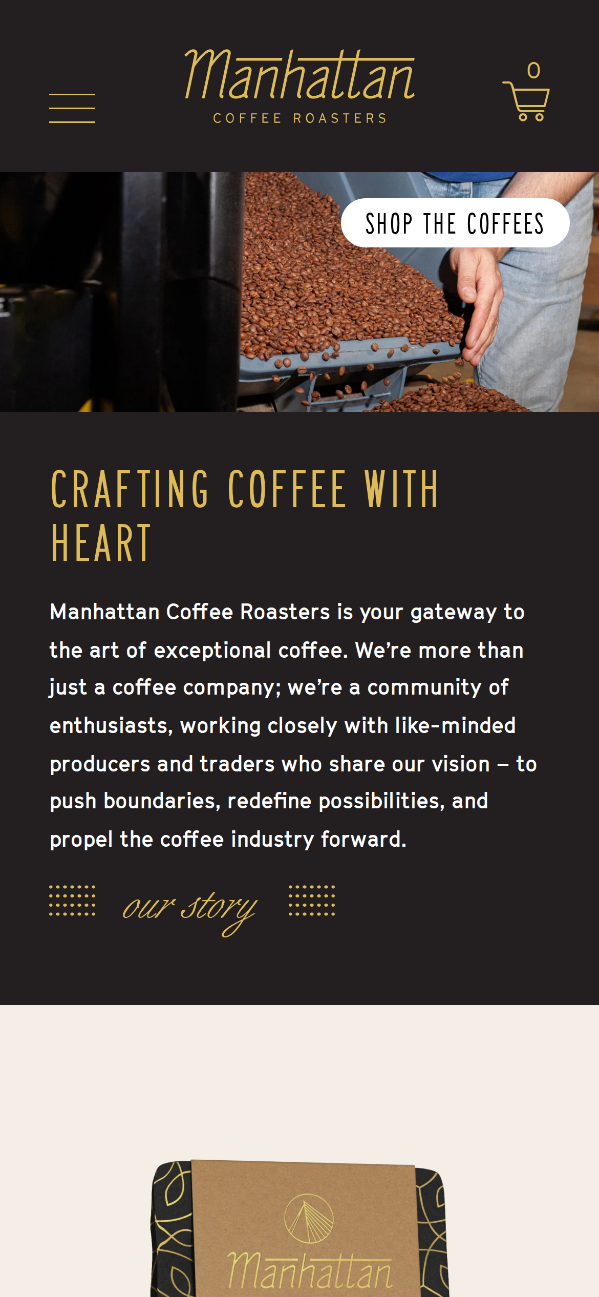
manhattancoffeeroasters.com is built on a warm, off-white canvas (rgb(244, 238, 230)).
The system uses rgb(221, 187, 86) as the accent for primary actions and brand signals.
Sharp 0px corners on CTAs — architectural restraint, engineering precision alongside SaaSeriesAD as the primary typeface.
Depth comes from borders and surface contrast rather than shadows — a flat, structural elevation model.
Motion is a first-class concern — 23 keyframe animations plus transition-driven interactions.
Accent #ddb44e · police principale GTCinetype
Chaque valeur ci-dessous est vérifiée à la capture. getdesign.md décrit — prismd montre : chaque couleur, police et courbe ici a été lue via getComputedStyle() sur le rendu réel capturé à droite, jamais affirmée à la main.
Rapport DESIGN.md complet · light & dark · fichiers tokens · Paiement non activé — on mesure la demande d’abord.
1 courbe d’easing · 23 keyframes · survole une tuile pour prévisualiser
Courbes & transitions
transition-1ease-out
23 animations keyframes extraites
spin
mmfadeIn
mmfadeOut
wc-skeleton-shimmer
klaviyo-fadein
klaviyo-fadeout
klaviyo-slideinleft
klaviyo-slideinright
klaviyo-slideinup
klaviyo-slideindown
klaviyo-fadeinup
klaviyo-slideintopleft
06
Composants — le vocabulaire fermé
12 familles de composants · 35 variantes comptées sur le DOM live
Composant
Variantes
links
×10
nav Links
×7
footer Links
×4
badges
×2
cta Banner
×2
heading H1
×2
heading H3
×2
eyebrow Labels
×2
buttons
×1
heading H2
×1
divider
×1
tooltip
×1
Specs de style des composants (§4)déplier
Inputs & Forms
Text Input
Background: #f9f9f9{colors.surface-2}
Text: #404040
Padding: 0px 0px 0px 16px
Radius: 0px
Border: 1px solid rgb(0, 0, 0)
Font: 14px weight 400
Use: Text fields, search inputs
07
Mise en page — structure & dimensions
5 métriques de layout mesurées
max Width1500px
header Height226px
sidebar Width0px
gap16px
container Padding0px
08
Responsive — vrais breakpoints
21 points de rupture lus dans le CSS live
38px
39px
40px
44px
56px
59px
61px
64px
75px
90px
98px
375px
600px
673px
700px
768px
1000px
1040px
1110px
1168px
1218px
09
À faire / À éviter
17 règles applicables, verbatim de la spec
À faire
Use Warm Cream (`#f4eee6`) as the page background — it's intentionally not pure white
Use GTCinetype as the primary typeface — it defines the brand personality
The system uses a single text weight (400) — hierarchy comes from size and color, not weight
Use Amber (`#ddbb56`) as the primary accent — it's the brand's signature interactive color
Style form inputs with a `1px solid rgb(0, 0, 0)` border — use border-based inputs, not floating labels or underline-only
Maintain nav height at 53.5938px — consistent vertical space for the navigation bar
Respect the 4px–48px spacing range — the design uses a wide scale for visual breathing room
Repeat the primary CTA across 2 banner sections — conversion paths are layered, not single
À éviter
Don't use pure white (`#ffffff`) as a page background — the warm tone is part of the brand identity
Don't substitute with generic sans-serif or serif — the custom font carries the brand
Don't introduce bolder or lighter weights — 400 is the only weight in this system
Don't introduce additional saturated accent colors — the palette is intentionally controlled
Don't remove the input border — the border is the primary affordance indicator for form fields
Don't collapse or hide the nav on scroll without an explicit scroll-triggered animation — the design uses fixed nav presence
Don't make the nav sticky — this design lets it scroll away to maximize content focus
Don't put a CTA button in the nav — this design uses links only at the top
Don't over-build the footer — this design keeps it minimal (1 cols, 5 links)
10
Guide agent & export
Prompt prêt à coller + les vrais fichiers derrière cette page
Construis une UI dans le design system de manhattancoffeeroasters.com.
Fond #f4eee6 · encre #111111 · accent #ddb44e.
Typo : GTCinetype — respecte l’échelle taille/graisse du §3.
Arrondis, espacements, ombres : uniquement les échelles extraites (aucun nombre magique).
La spec complète suit — colle le DESIGN.md ci-dessous dans ton agent.
Chaque valeur ci-dessus est vérifiée par getComputedStyle.