Analyse du design system

stadsoase.be

stadsoase.be is built on a warm, off-white canvas (rgb(240, 240, 201)). The system uses rgb(87, 189, 163) as the accent for primary actions and brand signals. Sharp 0px corners on CTAs — architectural restraint, engineering precision alongside Heebo as the primary typeface. Depth comes from borders and surface contrast rather than shadows — a flat, structural elevation model. Motion is minimal — a few targeted transitions, no decorative animation.

Accent #57bda3 · police principale Roboto

Chaque valeur ci-dessous est vérifiée à la capture. getdesign.md décrit — prismd montre : chaque couleur, police et courbe ici a été lue via getComputedStyle() sur le rendu réel capturé à droite, jamais affirmée à la main.

Rapport DESIGN.md complet · light & dark · fichiers tokens · Paiement non activé — on mesure la demande d’abord.
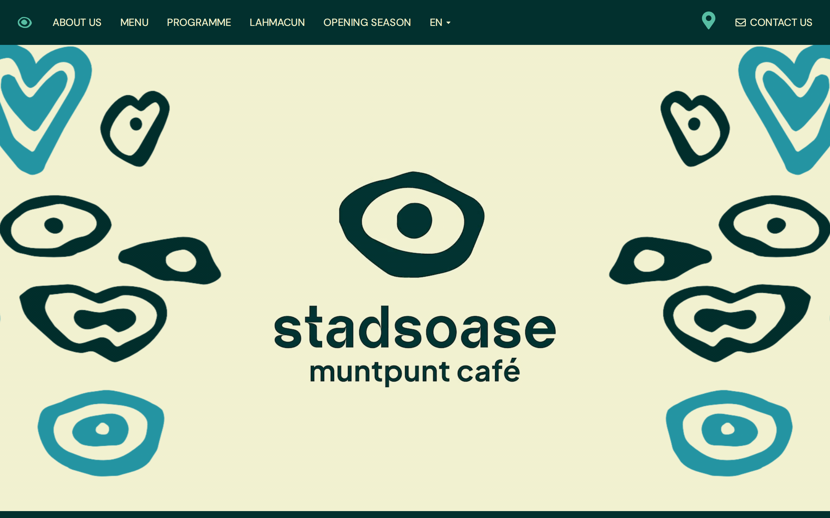
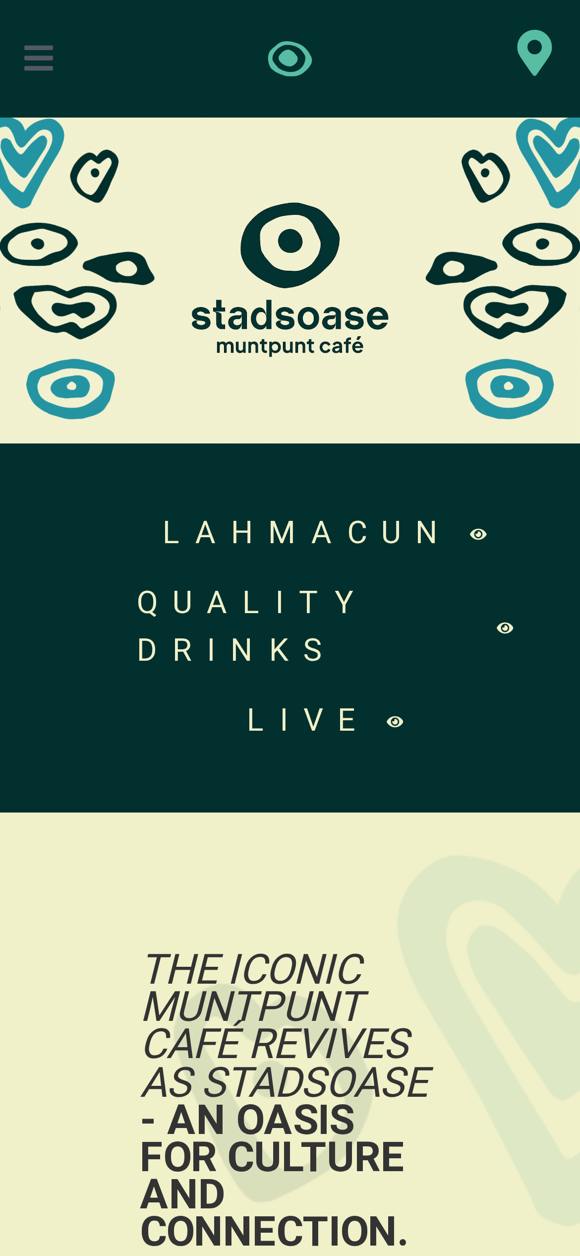
https://stadsoase.be/ ·extrait le 2026-07-13 ·scorer v2 ·moteur getComputedStyle
Desktop · source de vérité
stadsoase.be desktop
Mobile
stadsoase.be mobile
01

Couleurs — rôles, sémantique & recensement complet

8 couleurs mesurées · clique une pastille pour copier

Canvas
#f0f0c9
AAA 10.84:1
Ink
#333333
AAA 10.84:1
Accent
#57bda3
Fail 1.96:1
Line
#333333
AAA 10.84:1
États sémantiques

Aucune couleur d’état sémantique détectée — ce système signale l’état par le poids & le motion, pas la teinte.

8 couleurs extraites du rendu livedéplier
02

Typographie — l’échelle, dans la vraie police

4 rôles · rendu live dans la vraie Roboto (woff2 capturé) · lignes éditables, clique une spec pour copier

display xl
display-xl117px · 500
display lg
display-lg38px · 400 · ×3.08
body
body16px · 400 · ×2.38
button
button24px · 400 · ×0.67
03

Espacements & arrondis, rendus spatiaux

9 paliers d’espacement · 7 arrondis · barres = largeurs px exactes

Échelle d’espacement
xxs · 2px
xs · 7px
sm · 13px
md · 15px
base · 16px
lg · 24px
xl · 32px
2xl · 48px
3xl · 64px
Arrondis
none
0px
xs
3px
sm
8px
md
9px
lg
20px
xl
32px
full
9999px
05

Motion — courbes, transitions & keyframes réels

0 courbes d’easing · 1 keyframes · survole une tuile pour prévisualiser

1 animations keyframes extraites
eicon-spin
06

Composants — le vocabulaire fermé

9 familles de composants · 31 variantes comptées sur le DOM live

ComposantVariantes
links×8
accordion×6
nav Links×5
buttons×4
footer Links×3
heading H2×2
badges×1
status Badge×1
cta Banner×1
Specs de style des composants (§4)déplier

Buttons

Ghost

  • Background: transparent
  • Text: #cc3366
  • Padding: 0px
  • Radius: 3px
  • Font: 16px weight 400
  • Use: Subtle action, toolbar, nav button

Light / Invert

  • Background: #f0f0c9 {colors.background}
  • Text: #57bda3 {colors.primary}
  • Padding: 11px
  • Radius: 9px
  • Border: 3px groove rgb(87, 189, 163)
  • Font: 24px weight 400
  • Use: Bright CTA on dark sections

Navigation

Main Nav

  • Background: #02302e
  • Padding: 15px 0px
  • Radius: none
  • Font: 16px weight 400
  • Use: Fixed/sticky flex nav — N/A items
07

Mise en page — structure & dimensions

5 métriques de layout mesurées

header 78px 100% max-width
max Width100%
header Height78px
sidebar Width0px
gap16px
container Padding0px
08

Responsive — vrais breakpoints

10 points de rupture lus dans le CSS live

479px
575px
576px
767px
768px
991px
992px
1024px
1025px
1200px
09

À faire / À éviter

19 règles applicables, verbatim de la spec

À faire
Use Beige (`#f0f0c9`) as the page background — it's intentionally not pure white
Use Charcoal (`#333333`) for text — not pure black, it's warmer and more readable
Use Helvetica Neue as the primary typeface — it defines the brand personality
Keep font weights between 400-500 — the system uses a narrow weight range for subtle hierarchy (CSS declares up to 700, but the heaviest weight actually painted is 500)
Use Emerald (`#57bda3`) as the primary accent — it's the brand's signature interactive color
Use 8px border-radius on buttons — the standard corner rounding for interactive elements
Maintain nav height at 48px — consistent vertical space for the navigation bar
Make the hero full-viewport (≥70% screen height) — this design uses an immersive hero, not a tall navbar
Use a single primary CTA in the hero — the design intentionally avoids choice paralysis
Use expandable accordion for the FAQ — saves vertical space and lets users self-navigate
À éviter
Don't use pure white (`#ffffff`) as a page background — the warm tone is part of the brand identity
Don't use pure black (`#000000`) for text — the near-black adds warmth
Don't substitute with generic sans-serif or serif — the custom font carries the brand
Don't reach for weight 700 (bold) or above — 500 is the heaviest weight this design paints
Don't introduce additional saturated accent colors — the palette is intentionally controlled
Don't collapse or hide the nav on scroll without an explicit scroll-triggered animation — the design uses fixed nav presence
Don't make the nav sticky — this design lets it scroll away to maximize content focus
Don't put a CTA button in the nav — this design uses links only at the top
Don't over-build the footer — this design keeps it minimal (1 cols, 9 links)
10

Guide agent & export

Prompt prêt à coller + les vrais fichiers derrière cette page

Construis une UI dans le design system de stadsoase.be. Fond #f0f0c9 · encre #333333 · accent #57bda3. Typo : Roboto — respecte l’échelle taille/graisse du §3. Arrondis, espacements, ombres : uniquement les échelles extraites (aucun nombre magique). La spec complète suit — colle le DESIGN.md ci-dessous dans ton agent.
Chaque valeur ci-dessus est vérifiée par getComputedStyle.