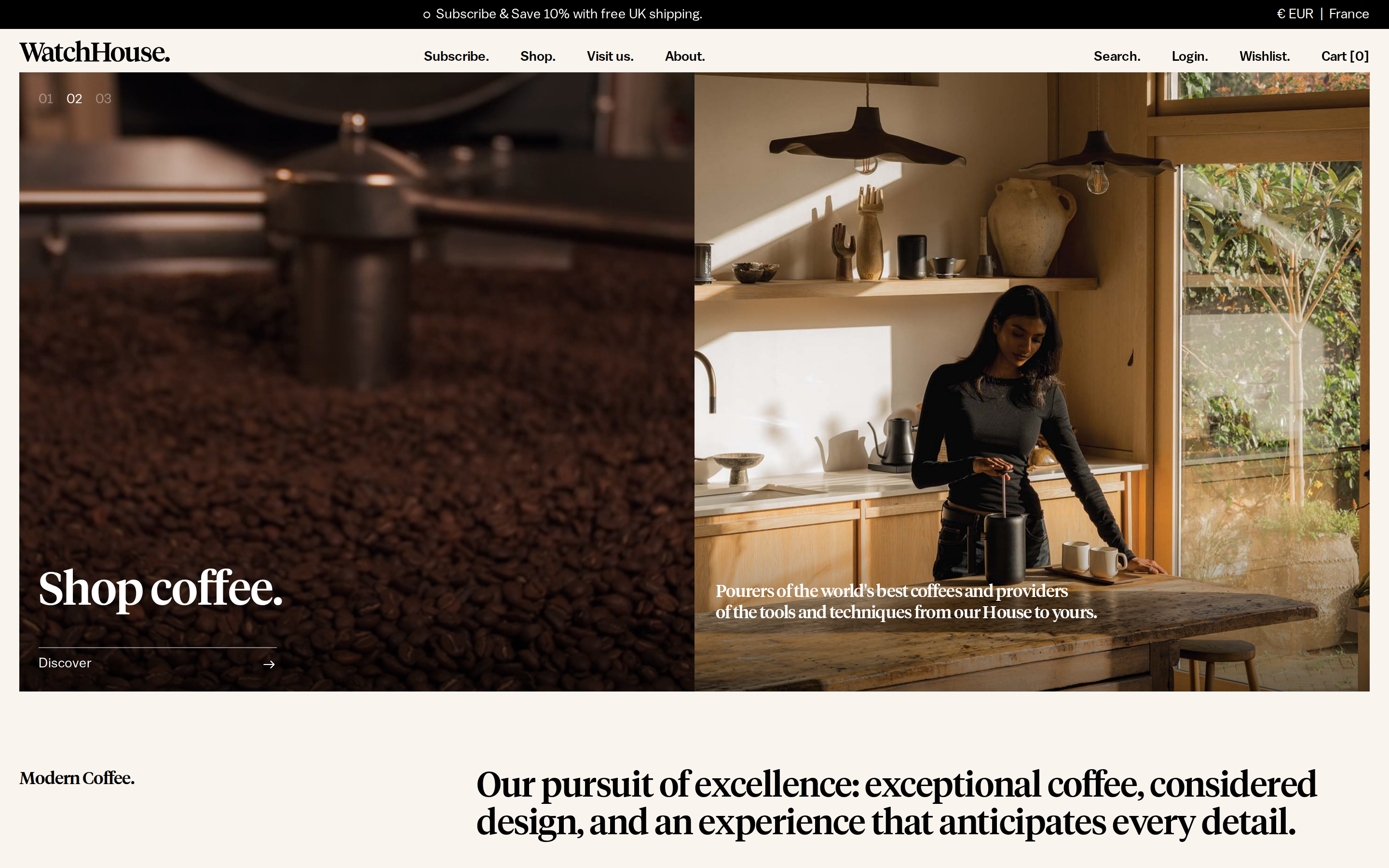
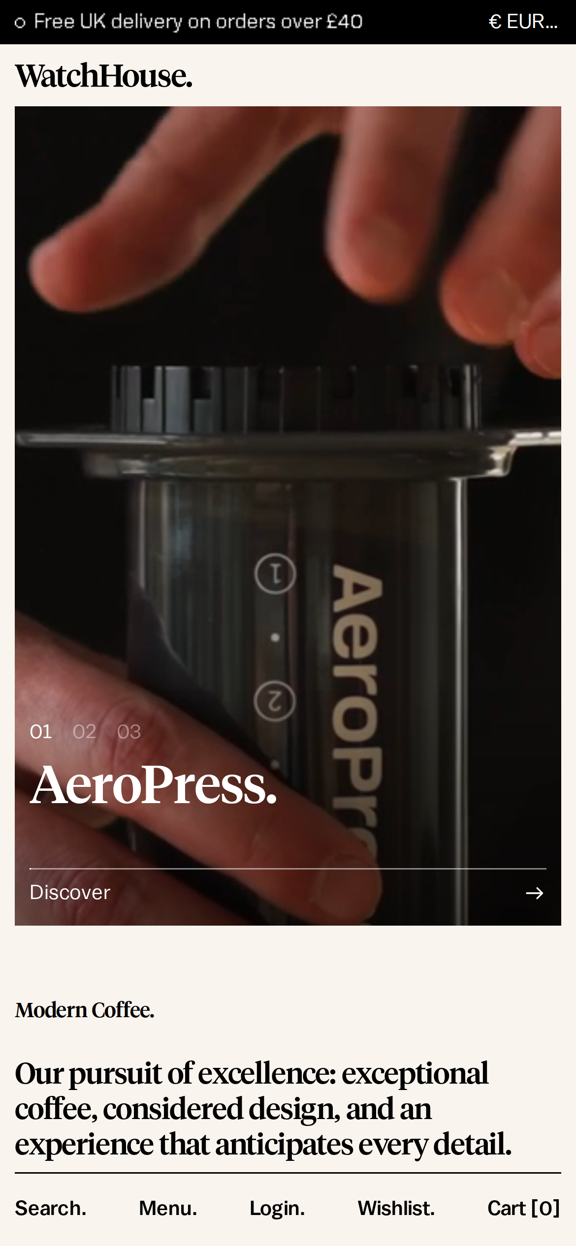
watchhouse.com is built on a warm, off-white canvas (rgb(249, 244, 238)).
The system uses #108474 as the accent for primary actions and brand signals.
Sharp 0px corners on CTAs — architectural restraint, engineering precision alongside editorial serif type (Tiempos Headline) — voice of authority.
A restrained elevation system (1 distinct shadow) — shadows reserved for the few elements that must lift off the page.
Motion is a first-class concern — 40 keyframe animations plus transition-driven interactions.
Accent #3a2a1e · police principale Balto
Chaque valeur ci-dessous est vérifiée à la capture. getdesign.md décrit — prismd montre : chaque couleur, police et courbe ici a été lue via getComputedStyle() sur le rendu réel capturé à droite, jamais affirmée à la main.
Rapport DESIGN.md complet · light & dark · fichiers tokens · Paiement non activé — on mesure la demande d’abord.
Profondeur — l’élévation est extraite, pas inventée
1 ombres mesurées sur la page live · clique une tuile pour copier sa valeur brute
shadow-1
05
Motion — courbes, transitions & keyframes réels
2 courbes d’easing · 40 keyframes · survole une tuile pour prévisualiser
Courbes & transitions
transition-1linear
transition-3ease-in-out
40 animations keyframes extraites
swiper-preloader-spin
shopify-rotator
shopify-dash
acceleratedCheckoutLoadingSkeleton
marquee-scroll
jdgm-spin
appear
routing-slideInFromRight-Wrk17
routing-slideOutToLeft-zPFYS
routing-slideInFromLeft-FTVeV
routing-slideOutToRight-L03hn
routing-slideOverFromRight-XWQTp
06
Composants — le vocabulaire fermé
14 familles de composants · 74 variantes comptées sur le DOM live
Composant
Variantes
nav Links
×9
logo Tile
×9
links
×9
cards
×7
cta Banner
×7
product Card
×7
footer Links
×6
buttons
×4
badges
×4
inputs
×3
heading H2
×3
price Tag
×3
heading H3
×2
heading H1
×1
Specs de style des composants (§4)déplier
Inputs & Forms
Text Input
Background: transparent
Text: #000000
Padding: 4px 0px 6px
Radius: 0px
Border: 0px none rgb(0, 0, 0)
Font: 12px weight 300
Use: Text fields, search inputs
Focus: outline: rgb(0, 0, 0) none 0px
CTA Banners
Full-width CTA
Background: transparent
Text: #000000
Padding: 0px 0px 10px
Radius: 0px
Font: 11px weight 300
Use: Full-width conversion strip with headline + button
07
Mise en page — structure & dimensions
5 métriques de layout mesurées
max Width100%
header Height75px
sidebar Width0px
gap16px
container Padding0px
08
Responsive — vrais breakpoints
14 points de rupture lus dans le CSS live
480px
484px
576px
600px
640px
699px
736px
750px
767px
768px
900px
1023px
1024px
1328px
09
À faire / À éviter
19 règles applicables, verbatim de la spec
À faire
Use Background (`#f9f4ee`) as the page background — it's intentionally not pure white
Use Balto as the primary typeface — it defines the brand personality
Keep font weights between 100-600 — the system uses a narrow weight range for subtle hierarchy (CSS declares up to 700, but the heaviest weight actually painted is 600)
Use negative letter-spacing (-0.4px) at display sizes for compressed, editorial headlines
Use the extracted shadow patterns for elevation — they are tuned to match the brand palette
Use Teal (`#108474`) as the primary accent — it's the brand's signature interactive color
Respect the 4px–32px spacing range — the design uses a wide scale for visual breathing room
Build the hero as a split layout with media on the right — text and visual share equal weight
Make the navigation sticky — it stays visible during scroll, signaling content depth
Include a search input directly in the nav — discoverability is a primary UX value here
Use a 3-column grid on desktop — density matters for this content type
Include a newsletter signup in the footer — email capture is part of the conversion funnel
À éviter
Don't use pure white (`#ffffff`) as a page background — the warm tone is part of the brand identity
Don't substitute with generic sans-serif or serif — the custom font carries the brand
Don't reach for weight 700 (bold) or above — 600 is the heaviest weight this design paints
Don't increase letter-spacing on headings — the type is designed to run tight at scale
Don't invent new shadow values — use only the extracted shadow levels
Don't introduce additional saturated accent colors — the palette is intentionally controlled
Don't put a CTA button in the nav — this design uses links only at the top
10
Guide agent & export
Prompt prêt à coller + les vrais fichiers derrière cette page
Construis une UI dans le design system de watchhouse.com.
Fond #f9f4ee · encre #111111 · accent #3a2a1e.
Typo : Balto — respecte l’échelle taille/graisse du §3.
Arrondis, espacements, ombres : uniquement les échelles extraites (aucun nombre magique).
La spec complète suit — colle le DESIGN.md ci-dessous dans ton agent.
Chaque valeur ci-dessus est vérifiée par getComputedStyle.