white-desert.com
white-desert.com is built on a pure-white canvas (rgb(255, 255, 255)). The system uses rgb(255, 126, 21) as the high-saturation accent for primary actions. Crisp CTAs (2px radius) reinforce a precise, technical aesthetic alongside Oswald as the primary typeface. A restrained elevation system (1 distinct shadow) — shadows reserved for the few elements that must lift off the page. Motion is a first-class concern — 6 keyframe animations plus transition-driven interactions.
Accent #ff7e15 · police principale Inter Tight
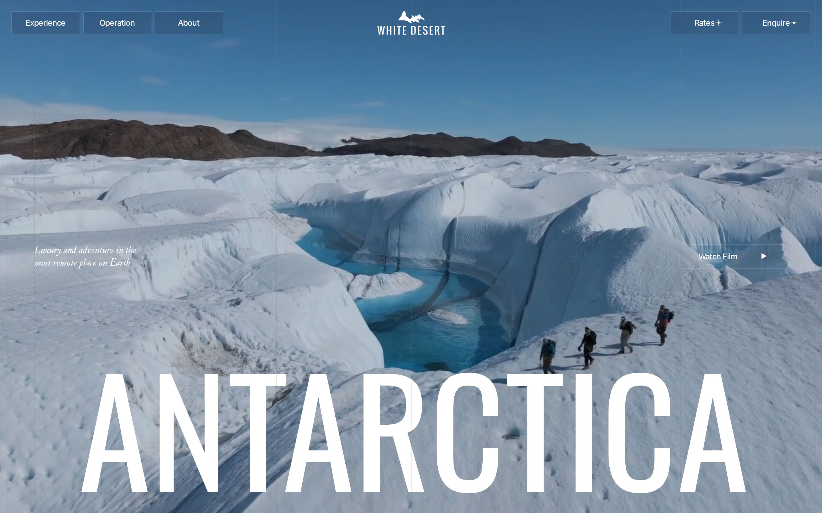
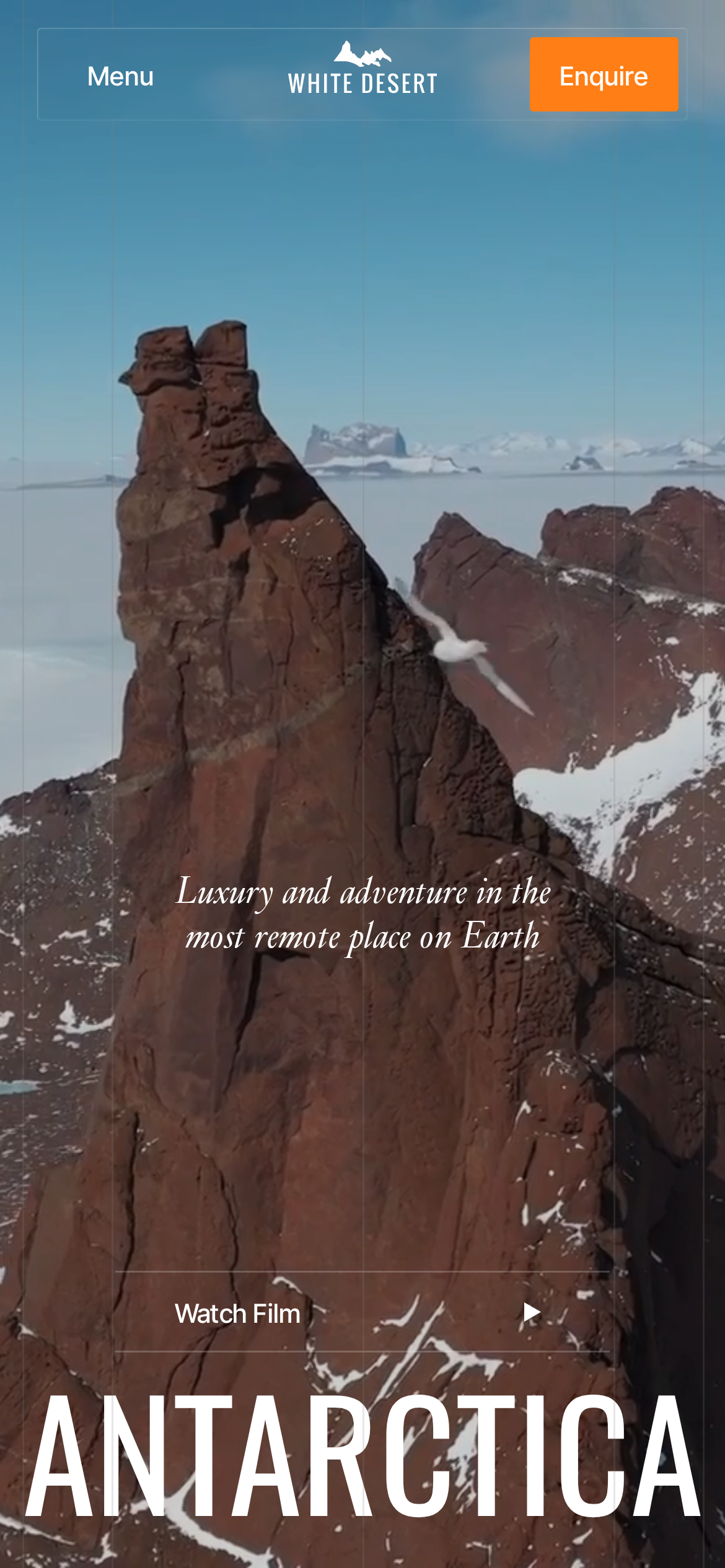
Chaque valeur ci-dessous est vérifiée à la capture. getdesign.md décrit — prismd montre : chaque couleur, police et courbe ici a été lue via getComputedStyle() sur le rendu réel capturé à droite, jamais affirmée à la main.
Rapport DESIGN.md complet · light & dark · fichiers tokens · Paiement non activé — on mesure la demande d’abord.
Couleurs — rôles, sémantique & recensement complet
13 couleurs mesurées · clique une pastille pour copier
Aucune couleur d’état sémantique détectée — ce système signale l’état par le poids & le motion, pas la teinte.
13 couleurs extraites du rendu livedéplier
Typographie — l’échelle, dans la vraie police
6 rôles · rendu live dans la vraie Inter (woff2 capturé) · lignes éditables, clique une spec pour copier
Espacements & arrondis, rendus spatiaux
9 paliers d’espacement · 7 arrondis · barres = largeurs px exactes
0px
4px
5.99999px
14px
20px
32px
9999px
Profondeur — l’élévation est extraite, pas inventée
1 ombres mesurées sur la page live · clique une tuile pour copier sa valeur brute
Motion — courbes, transitions & keyframes réels
5 courbes d’easing · 6 keyframes · survole une tuile pour prévisualiser
Composants — le vocabulaire fermé
12 familles de composants · 54 variantes comptées sur le DOM live
| Composant | Variantes |
|---|---|
| buttons | ×10 |
| cards | ×10 |
| heading H3 | ×8 |
| links | ×8 |
| nav Links | ×5 |
| cta Banner | ×3 |
| badges | ×2 |
| status Badge | ×2 |
| heading H2 | ×2 |
| eyebrow Labels | ×2 |
| heading H1 | ×1 |
| divider | ×1 |
Specs de style des composants (§4)déplier
Buttons
Subtle
- Background:
rgba(31, 42, 68, 0.2){colors.hairline} - Text:
#ffffff{colors.primary-focus} - Padding: 0px 16px
- Radius: 2px
- Font: 16px weight 400
- Use: Quiet action against page bg
- Hover: backgroundColor:
#ff7e15, border:0px none rgb(255, 126, 21), borderColor:#ff7e15 - Focus: backgroundColor:
rgba(199, 105, 33, 0.5), border:0px none rgb(255, 207, 167), borderColor:rgb(255, 207, 167)
Light / Invert
- Background:
#f3f1ec{colors.surface-1} - Text:
#1f2a44{colors.hairline} - Padding: 0px
- Radius: 2px
- Border: 1px solid rgba(255, 255, 255, 0.2)
- Font: 16px weight 400
- Use: Bright CTA on dark sections
- Hover: backgroundColor:
#ff7e15, border:0px none rgb(255, 126, 21), borderColor:#ff7e15 - Focus: backgroundColor:
rgba(199, 105, 33, 0.5), border:0px none rgb(255, 207, 167), borderColor:rgb(255, 207, 167)
Subtle
- Background:
rgba(31, 42, 68, 0.05){colors.hairline} - Text:
#ffffff{colors.primary-focus} - Padding: 20px
- Radius: 5.99999px
- Font: 16px weight 400
- Use: Quiet action against page bg
- Hover: backgroundColor:
#ff7e15, border:0px none rgb(255, 126, 21), borderColor:#ff7e15 - Focus: backgroundColor:
rgba(199, 105, 33, 0.5), border:0px none rgb(255, 207, 167), borderColor:rgb(255, 207, 167)
Cards & Containers
Standard Card
- Background:
transparent - Padding: 0px
- Radius: 4px
- Use: Content containers, listing items
Inputs & Forms
Text Input
- Background:
transparent - Text:
#000000 - Padding: 0px
- Radius: 0px
- Border: 0px none rgb(0, 0, 0)
- Font: 14px weight 400
- Use: Text fields, search inputs
CTA Banners
Full-width CTA
- Background:
rgba(31, 42, 68, 0.15){colors.hairline} - Text:
#ffffff{colors.primary-focus} - Padding: 0px 16px
- Radius: 2px
- Font: 16px weight 400
Mise en page — structure & dimensions
5 métriques de layout mesurées
Responsive — vrais breakpoints
7 points de rupture lus dans le CSS live
À faire / À éviter
22 règles applicables, verbatim de la spec
Guide agent & export
Prompt prêt à coller + les vrais fichiers derrière cette page