Prism prismd.fr
Extracted · 10 sections · 40 colors · grade C

x.ai

Accent #5e6ad2 · universalSans — chaque valeur ci-dessous est mesurée via getComputedStyle(), jamais affirmée à la main.

40
colors
9
faces
8
shadows
18
keyframes
x.ai
rendu réel · source de vérité

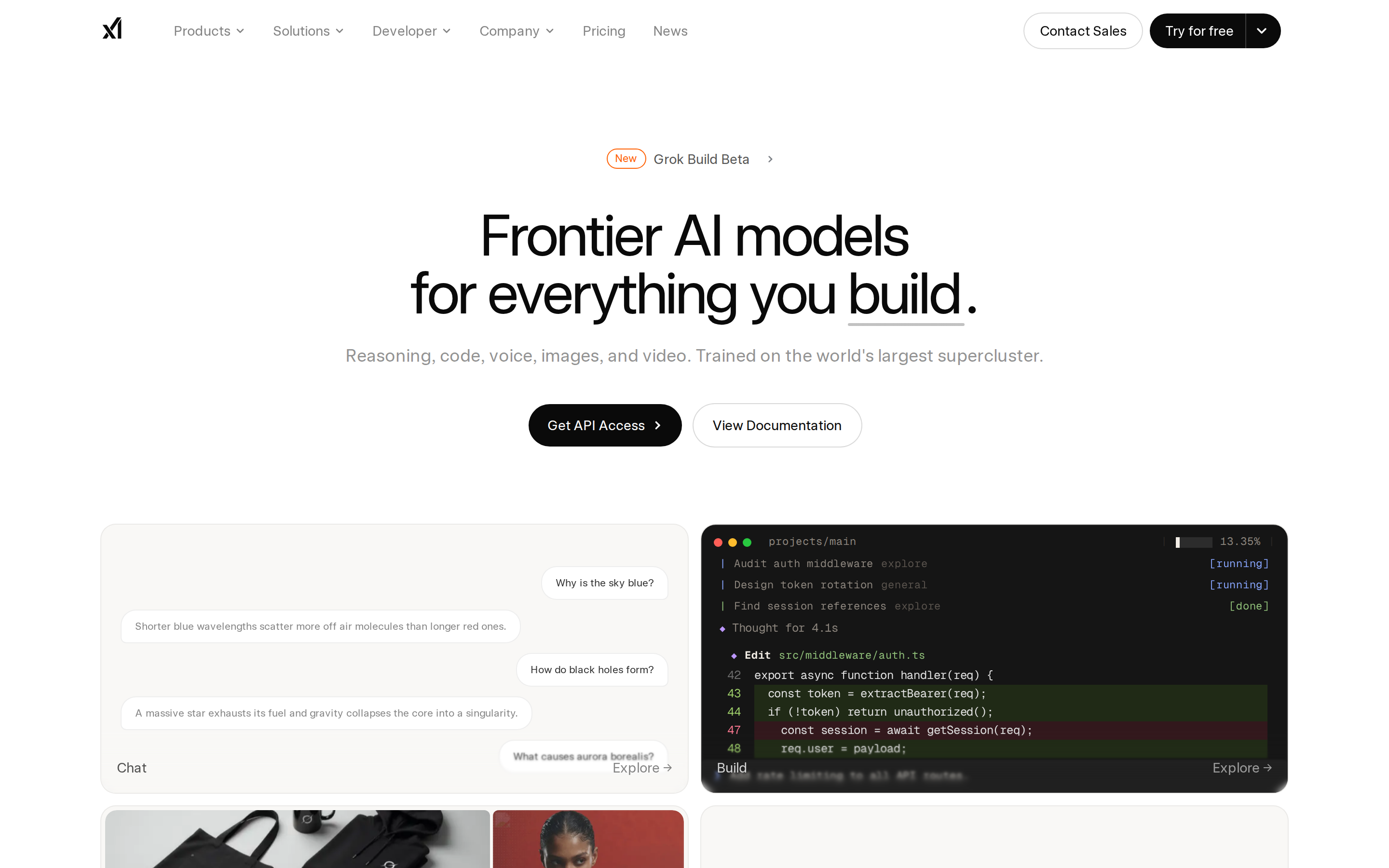
x.ai is built on a pure-white canvas (rgb(255, 255, 255)). The system uses rgb(249, 248, 246) as a near-neutral accent (low saturation). Fully-rounded CTAs (9999px) signal a friendly, tactile interaction model alongside universalSansDisplay as the primary typeface. UniversalSansDisplay is paired with universalSans Fallback for secondary roles. A layered elevation system (8 distinct shadows) building a clear front-to-back hierarchy. Motion is a first-class concern — 18 keyframe animations plus transition-driven interactions.

01

Color — roles, semantics & the full census

40 colors measured · click any swatch to copy

Canvas
#ffffff
AAA 19.8:1
Ink
#0a0a0a
AAA 19.8:1
Accent
#f9f8f6
Fail 1.06:1
Line
#d5d9e2
Fail 1.41:1
Semantic states

No semantic state colors detected — this system signals state through weight & motion, not hue.

40 colors mined from the live renderexpand
02

Type — the ladder, in the real face

3 roles · rendered live in the real Inter (captured woff2) · lines are editable, click any spec to copy

display xl
display-xl60px · 500
display md
display-md14px · 500 · ×4.29
body
body16px · 400 · ×0.88
03

Spacing & radius, made spatial

9 spacing steps · 7 radii · bars are exact px widths

Spacing scale
xxs · 2px
xs · 8px
sm · 12px
md · 16px
base · 52px
lg · 74px
xl · 96px
2xl · 144px
3xl · 148px
Radius
none
0px
xs
4px
sm
8px
md
12px
lg
16px
xl
9999px
full
9999px
04

Depth — elevation is extracted, not invented

8 box-shadows measured on the live page · click a tile to copy its raw value

shadow-1
shadow-2
shadow-3
shadow-4
shadow-5
05

Motion — easings, transitions & live keyframes

1 easing curve · 18 keyframes · hover a tile to preview

Easing & transitions
transition-3cubic-bezier(0.4, 0, 0.2, 1)
18 keyframe animations extracted
marquee
pulse
slideUpAndOut
spin
waveform
fadeIn
tooltip-in
tooltip-out
border-beam
context-menu-in
context-menu-out
hero-shimmer
06

Components — the closed vocabulary

9 component families · 48 variants counted on the live DOM

ComponentVariants found
buttons×10
cards×10
links×10
nav Links×5
code Block×4
footer Links×3
heading H3×3
heading H2×2
heading H1×1
Component style specs (§4)expand

Buttons

Icon Button

  • Background: transparent
  • Text: #ffffff {colors.surface-1}
  • Padding: 0px 12px 0px 8px
  • Radius: 0px 9999px 9999px 0px
  • Font: 16px weight 400
  • Use: Toolbar/UI icons
  • Focus: outline: rgba(0, 0, 0, 0) solid 2px

Pill

  • Background: transparent
  • Text: #0a0a0a {colors.ink-subtle}
  • Padding: 8px 16px
  • Radius: 9999px
  • Shadow: rgba(10, 10, 10, 0.15) 0px 0px 0px 1px
  • Font: 14px weight 500
  • Use: Status pills, tags, chips
  • Focus: outline: rgba(0, 0, 0, 0) solid 2px

Pill

  • Background: transparent
  • Text: #ffffff {colors.surface-1}
  • Padding: 8px 12px 8px 16px
  • Radius: 9999px 0px 0px 9999px
  • Font: 14px weight 500
  • Use: Status pills, tags, chips
  • Focus: outline: rgba(0, 0, 0, 0) solid 2px

Light / Invert

  • Background: #f9f8f6 {colors.primary}
  • Text: #0a0a0a {colors.ink-subtle}
  • Padding: 0px
  • Radius: 16px
  • Border: 1px solid rgba(10, 10, 10, 0.06)
  • Font: 16px weight 400
  • Use: Bright CTA on dark sections
  • Focus: outline: rgba(0, 0, 0, 0) solid 2px

Light / Invert

  • Background: #f9f8f6 {colors.primary}
  • Text: #0a0a0a {colors.ink-subtle}
  • Padding: 4px
  • Radius: 16px
  • Border: 1px solid rgba(10, 10, 10, 0.06)
  • Font: 16px weight 400
  • Use: Bright CTA on dark sections
  • Focus: outline: rgba(0, 0, 0, 0) solid 2px

Cards & Containers

Standard Card

  • Background: #f9f8f6 {colors.primary}
  • Padding: 0px
  • Radius: 12px
  • Shadow: rgba(0, 0, 0, 0.1) 0px 20px 25px -5px, rgba(0, 0, 0, 0.1) 0px 8px 10px -6px
  • Use: Content containers, listing items
07

Layout — structure & dimensions

5 layout metrics measured

header 64px 1200px max-width
max Width1200px
header Height64px
sidebar Width0px
gap16px
container Padding24px
08

Responsive — real breakpoints

8 media-query stops read from the live CSS

360px
600px
640px
768px
1024px
1280px
1536px
2000px
09

Do's & Don'ts

25 enforceable rules pulled verbatim from the spec

Do
Use Pure Black (`#0a0a0a`) for text — not pure black, it's warmer and more readable
Use universalSans as the primary typeface — it defines the brand personality
Keep font weights between 400-500 — the system uses a narrow weight range for subtle hierarchy
Use negative letter-spacing (-1.5px) at display sizes for compressed, editorial headlines
Use the extracted shadow patterns for elevation — they are tuned to match the brand palette
Use full-pill radius (9999px) only for specific elements (avatars, pills, toggles)
Use Off-White (`#f9f8f6`) as the primary accent — it's the brand's signature interactive color
Use pill-shaped radius (9999px) for primary CTA buttons — the brand uses fully-rounded, pill CTAs
Use 12px border-radius on cards — consistent with the grid card corners
Maintain nav height at 64px — consistent vertical space for the navigation bar
Respect the 8px–96px spacing range — the design uses a wide scale for visual breathing room
Make the hero full-viewport (≥70% screen height) — this design uses an immersive hero, not a tall navbar
Build the hero as a split layout with media on the right — text and visual share equal weight
Include exactly 7 CTAs in the hero (primary + secondary) — this design pattern is multi-action, not single-purpose
Don't
Don't use pure black (`#000000`) for text — the near-black adds warmth
Don't substitute with generic sans-serif or serif — the custom font carries the brand
Don't use weight 700 (bold) or above — 500 is the maximum weight in this system
Don't increase letter-spacing on headings — the type is designed to run tight at scale
Don't invent new shadow values — use only the extracted shadow levels
Don't apply pill radius on rectangular buttons or cards — it's reserved for specific interactive elements
Don't introduce additional saturated accent colors — the palette is intentionally controlled
Don't use rectangular buttons for primary actions — the rounded pill shape is the brand standard
Don't collapse or hide the nav on scroll without an explicit scroll-triggered animation — the design uses fixed nav presence
Don't make the nav sticky — this design lets it scroll away to maximize content focus
Don't put a CTA button in the nav — this design uses links only at the top
10

Agent guide & export

Paste-ready prompt + the real files behind this page

Build a UI in the x.ai design system. Canvas #ffffff · ink #0a0a0a · accent #f9f8f6. Type: universalSans — respect the size/weight ladder in §3. Radius, spacing, shadow: use only the extracted scales (no magic numbers). Full spec follows — paste the DESIGN.md below into your agent.
Every value above was getComputedStyle-verified.